A warm welcome to all my visitors,

Thank you for taking the time to come and look at my blog, I really do appreciate it. I would love you to leave me a comment, even if it’s just to say Hi. It means I can come visit you!

All my designs are original, so copyrighted to me. If I have been inspired by someone elses work, I have named them in the post, and where able, I have provided a link.

Please feel free to use my designs for inspiration, I just ask you to credit me, and provide a link back to my blog.

Thanks, Shaz XX

Showing posts with label Gold. Show all posts

Sunday, 4 February 2018

Christmas Card Club Challenge #3- Angels or Fairies.

This fortnights challenge is chosen by Granmargaret, and calls for Angels or Fairies.
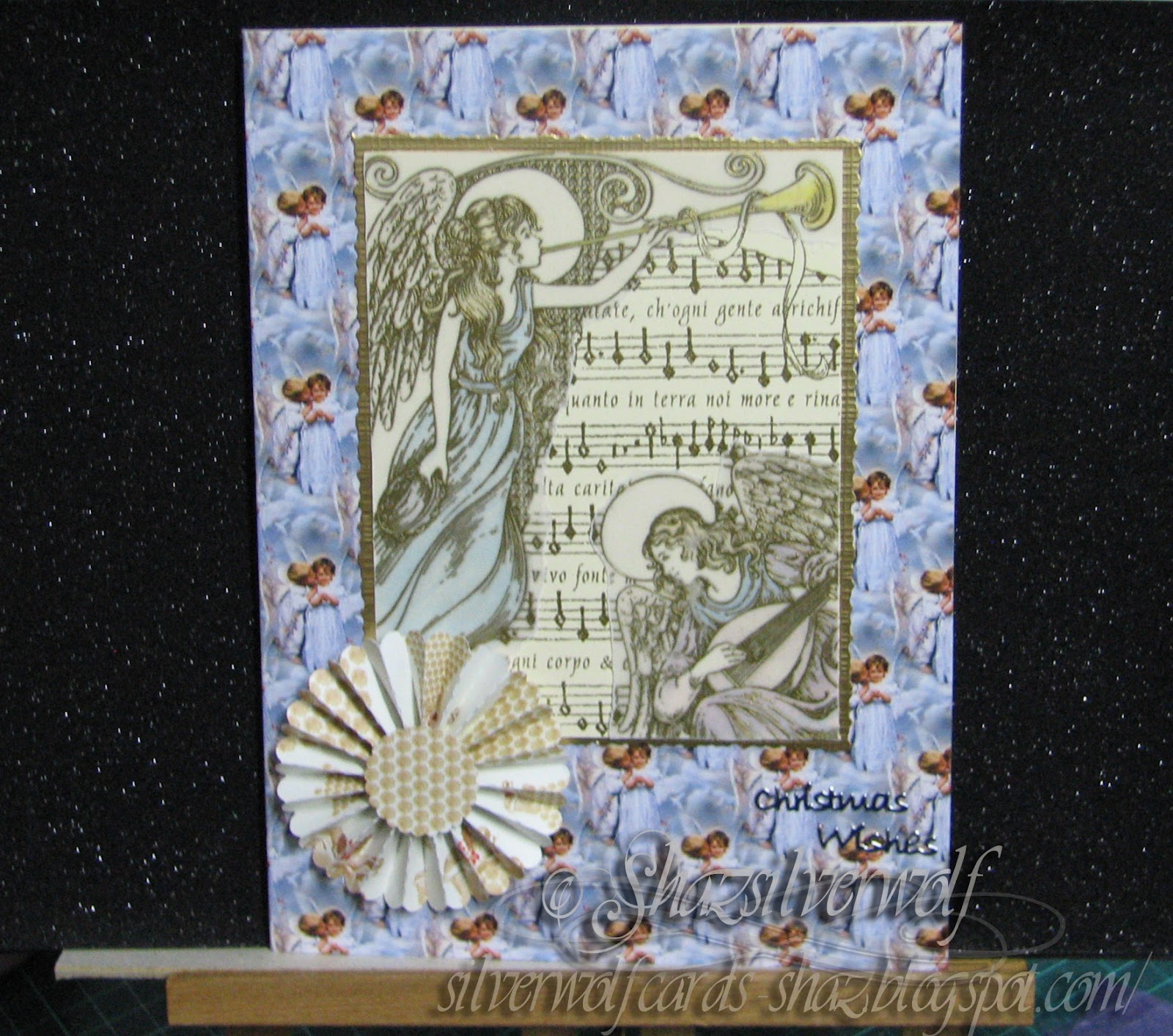
Two different cards, one square in blue, and one Easel fold in brown. The papers for both come from a pad I picked up in The Works last year,and is a slightly unusual format of 15cm x30cm. Which worked perfectly for the easel card!
 The stamp is by Rubber Stampede, called Angel Chorus Collage. I doubt it's still available, as I can remember this was one of the first Christmas stamps I bought, and that would be close on 15 years ago.

 OK, I'm officially shocked! Just went off to see if it was available, and turns out it is! A UK online retailer called Carysma has it, along with a whole load of other fabulous Rubber Stampede stamps!

 The circular Happy Christmas stamp is by Circa Design, and comes as a set of three called Christmas Circles. The other two are Seasons Greetings and Happy New year.


So to start with the Blue one, I took a 6" square card base and covered with the paper. The Angel stamp was stamped onto a dark blue cardstock with gold encore Pigment ink, and heat embossed in gold. I trimmed it flush with the edges of the image, then cut some gold glitter cardstock the same size and matted them together, offset. The greeting was stamped in Archival Cobalt onto a matching sheet of blue paper from the pack, then die cut with a small hexagon die. This also was matted onto glitter card, then trimmed down and mounted with a foam tab.
This is my favourite go to technique for this stamp, and was a design I saw in a magazine a lot of years ago. Firstly the image is stamped onto cardstock and heat embossed in gold again, then stamped again onto vellum, heat embossing in gold again.
 Both pieces are trimmed down to the same size, and the vellum is torn down around the two angels.
 Next I added Vintage Photo DI around the cardstock, then a little shading on the reverse of the vellum with Promarkers. That keeps it nice and subtle. It's such a detailed stamp, it needs the subtle treatment, it's easy to overpower the image- I had a couple of fails while doing this where just that happened. I'll show them at the end.😡
 Next both pieces of vellum are attached to the relevant part of the cardstock image, and another light coating of Vintage Photo added over the top. You can add glue- either a liquid like Glossy Accents, or a snail type adhesive in small spots behind  the shading.
 The whole piece was matted onto an embossed gold cardstock, and mounted onto the Easel card base, which I'd covered with a Brown version of the same Christmas pad paper. A couple of Flourishes die cut from the gold card added to opposite corners, and a white Poinsettia made from a Spellbinders die topped it off. The same sentiment as the first card was stamped in Archival Cocoa, die cut with a circle die. I cut a second piece, this time with a  scalloped die to mount it onto, then added to the card base with a foam pad.


These two were made last year with the stamp, this time using Brilliance Pearlescent Sky Blue, and the same technique.

Both were easel cards.


 I said I'd show you my fails!
 On the left, I tried covering the image with double sided adhesive sheet and Glamourdust, funny thing is, in this picture it doesn't look too bad, but in reality, much of the detail of the stamp is lost, it just looks blurred to the naked eye.

On the right, I thought I'd try adding Gilding flake to the wings. Another fail. It looked terrible, so I went over it with a gold metallic marker, which just made it worse rather than better. I should have used some sheet golf leaf, rather than the loose stuff I think.

Wednesday, 23 July 2014

WOYWW #268

New look this week, I decided that as I have gazillions of photos on my pc, I'd have one as my blog background, for a change. Although you can only see parts of it, the picture was taken at St Nectans Glen, near Tintagel in Cornwall. An awesomely lovely place.
 Back to the reason for our being all together on Wednesday, our weekly visit to Dunnit Towers, at The Stamping Ground, with our gracious hostess, Julia for this weeks WOYWW.
Brace yourselves, here is the desk in mid-create:
No inks involved this week,and not a stamp in sight, just lots of die cuts and punched flowers. Two wedding cards for two people at work who are getting married next month.  Both couples are Polish, and they really prefer gold and white for their wedding cards, so  lots of both here. Mid way through assembling the flowers at the moment, the daisy like ones are a Heartfelt Creations Spellbinders die, called Delicate Asters. A lovely flower, but an absolute b****r to get it to cut. Doesn't cut through completely in my 'bug, even with the metal shim plate, it only works properly in the BSPro. Anyhow, after trail and error, and a lot of new swear words invented, I got it sorted.The small flowers are done from X-cut punches, two flowers layered up. Oh, and I didn't use the largest of the Aster die cuts, just the three smaller ones. A few other die cuts knocking about, the hearts are  Memory Box- two dies, Grand Heart for the base and La Rue heart that fits on top. Just. Almost fits more on the outside of the heart, rather than the edge, if you know what I mean. A bit fiddly to put together accurately, to be honest. Especially when its got glue on it. Bottom left corner are some doves, cut on the Silhouette. That's something else the Poles are fond of on Wedding cards. Everywhere else, assorted detritus, leftovers, and UFO's. So that's my offering this week, with a nice bit of sunshine through the window to boot. Those storms, eh? I think we had more thunder and lightening last week than we normally get in a whole year here. Most storms just seem to edge past us, I think mainly due to the Malvern Hills pulling them that way. Have a great week everyone, see you all later.

Sunday, 30 September 2012

Long Time No See

Been quite a while since I last posted, but life kept getting in the way! I'll post some pictures another time of the stuff thats been going on in the house, which is gradually getting sorted. But I thought I'd post a few pictures of stuff I've been doing over the last few months, and apologies to everyone who has kept up visiting, only to find nothing new.
These two cards were for the same wedding- always a problem making cards to go to the same people! Both of the people who ordered them wanted Easel cards.
 The flowers on both are the Tim Holtz Tattered Florals- I got the large & small versions,( Alterations & Movers & Shapers) which gives me even more adaptability when building up flowers. In the Gold card, I used a Celtic Horseshoe stamp. I think this came from the Aspects Of Design range, quite a few years ago, and I am pretty sure it is discontinued, which is a shame. Also used Tims Flourish die, and Nesties Labels 7. The centres of the flowers were filled with Glossy Accents and seed beads. The large Congratulations was cut out with the Silhouette.
The Black & White card has flowers cut from vellums and black & white pearl paper, triple embossed hearts in black & silver and Nesties Labels 4. I used black & white seed beads for the centres of the flowers again.

I'm also discovering that Blogger has changed a little while I've been gone!  I am not having any trouble posting any more, which is good, but I really don't like the changes they have made to the 'Labels' section. Maximum number of labels, ok, I was getting my head around that, learning to be brief, then I discover its a maximum number of characters too. What on earth is that all about? Its our blog, why does it matter how many tags we put on a post, or how many characters it uses? Not a happy bunny. Going to try another post using Livewriter and see if it applies through that too. I suspect it will, as its a Blogger rule. Off over to Blogger to find out what they are playing at, lol.

Another Easel Birthday

Easel cards have been a bit of a theme, as the person ordering cards off me lately really likes them and asks for them particularly.
Cards for men are never the easiest, so many stamp companies really don't cater for male images, so usually my go-to stamps are the Stampscapes scenics.
 This one features stamps from Nature Sheet 6, stamped onto a pale grey brayered background in Black Versafine. I matted that onto two colours of green card. The background paper is Shamrocks, downloaded off the net a while ago, and you can see I used a leftover piece as the sentiment background and also cut out a couple of Shamrocks and mounted them with silicone glue.
 I wrapped dark green ribbon around the card and created a folded bow, and finally added a green & gold flower.

Easel Birthdays


All three of these were for the same person, so it was hard work making them all as different as possible! Two feature the Tim Holtz Tattered Florals,and I love the fact that they will cut pretty much any material- I've been using up a lot of fancy papers that I have collected, and some of the flowers I really love- the green & gold in the bottom card is a particular favourite. That one also has a four panel image of the Penny Black stamp 'Aspire', matted onto gold & wrapped with a narrow gold organza ribbon. Nesties Labels 7 was used for the sentiment here.
 The top left card features a Chocolate Baroque stamp, Harlequin Rose, which is part of an A4 sheet.The image was stamped in black, mica powders smudged onto the background and chalks & micas used to colour the Rose & leaves.The background is an embossing folder, Creative Expressions' Lattice'. Wrapped with silver & black ribbon and embellished with Black & White Tattered Florals. I have to say that Black & White really is my favourite go-to theme. Nesties Labels 4 was used on this one.
 Top right, the background is another sheet of fancy paper, a vellum panel punched with Doily Dots and some Tim Holtz Rosettes, cut from black & white vellum. The Butterfly panel was made with Fusible Fibres, and I cut out a second set of butterflies to mount on top with silicone glue. the stamp itself is available from two places, Tanda Stamps, Far East Set 1, either as a plate along with other oriental themed stamps, or individually. It is also available from  De Stempelwinkel, as a Non Sequiteur Plate, Samurai Plate. The sentiment is on Nesties Petite Scalloped Ovals Large. On all the cards, the foil printed background paper on the bottom is from Craft Creations.

Thursday, 29 March 2012

Ruby Anniversary Easel card

Had some some fun playing with new dies I bought this week: the Tim Holtz Tattered Florals,Movers & Shapers Tattered Florals,Elegant Flourish, and Memory Box La Rue Heart.  I had seen so many good things done with the Tim Holtz dies, and they are so much fun to work with.
 The Lattice 40 was a design I found on UKScrappers, for the Silhouette, posted by a lady called Neries, and her name links to the page it is posted on. I cut it from dark red paper, than layered it onto a pale gold paper.
 The Gold Anniversary backing paper, and the White Congratulations paper are both by Craft Creations, and come in a range of colours with gold or silver foiled print.
  The La Rue heart was cut from the same pale gold paper, and matted onto a heart cut from the dark red paper. I loved the elegant filigree design of the heart, and there is also a heart die that cuts out the block shape. I didn't get that one, I just cut around the outside of the filigree design when it was stuck down, but the die would be useful, I think. I mounted the heart with sticky tabs, using one layer at the front and two layers at the back to give it a little dimension.


I cut out a selection of flowers and flourishes in various card and paper , and curled the petals with the handle of a small paintbrush, then used an embossing stylus in the centres to give them all some shape.


 The layers of petals were stacked up using silicone glue.
The addition of same small seed beads to the centres, with Glossy Accents, finished them off nicely.
 The 40 was added with sticky pads, and then some Burgundy acrylic hearts on to this with a tiny spot of silicone glue. I used silicone glue again to mount the flowers, along with some short pieces of gold & burgundy ribbon. I tucked the two Elegant Flourishes in behind the flowers.


Wednesday, 28 December 2011

Last couple of Christmas cards


Both these cards use a stamp called Angel Chorus Collage, which I thought I had shown on here before, but apparently not. Its made by Rubber Stampede,and is available still, I found it here. I used a technique I saw done a long time ago, in a magazine, but I really can't remember who by. I stamped the image first on cream card and heat embossed with gold powder. I stamped & heat embossed in gold again onto plain vellum. I coloured the image on the card quite roughly with Promarkers- you don't need precise colouring, as the vellum softens the look of the colours.Then I tore around the angel images on the vellum, and placed them over the card versions, using some adhesive roller, the Stix2 one.I trimmed the images down and matted onto gold card. The backing paper on the card on the left is from a Joanna Sheen cd, and the other one is, I think, a Paper Pizzaz one, but I may be wrong. I have so many Christmas paper sheets I have had for years, I am trying to get some use from them, and stop hoarding, lol. Both have a rosette on them. I love those, I think I may end up doing rosettes to death if I'm not careful.
You could also colour on the back of the vellum, and oil pastels would work well for that.I just liked the softness that the vellum gave over the card image.

Monday, 12 September 2011

Oriental Poppy in Gold

   This is a stamp by Hampton Arts, 4523 Asian Poppy, which still seems to be available, I found it here, and here. The background was brayered with Adirondack Lemonade, Sunshine yellow and Sunset orange, the Post-it note Sun mask was added after the Lemonade.The Image was stamped in Versafine onyx black then heat embossed with clear powder. It is matted onto black cardstock, then mounted to the card front. the base card was cut to 14cm square, then covered with a gold patterned washi paper, I think this was in a pack from Hobbycrafts. The Japanese Shop also has a great choice of washi papers,as do Roze. An Oriental coin and Black & Orange ribbon finished it off.

Sunday, 11 September 2011

Oriental Poppy #2 Tag


The Oriental Poppy & Script image is clearly very popular, and this is a different take on the theme. I finally found out where I got this from- it was featured recently in Craft Stamper Magazine. It is Aspects of Design, Floral 01, from The Stampman. Here it is stamped on an alcohol ink background, in Black & heat embossed. I cut this into a tag, and cut a slightly larger tag from black glitter paper to matt it on to. I added a chinese coin, and the two little black sticks are cut down cocktail sticks, rolled on an embossing pad and dipped into black embossing powder, then heated! I tied a little red raffia around them, and attached them and the coin with a dab of silicone glue.A few strands of red & black fibres finished off the tag. The paper that covers the base was part of a roll I bought years ago one Christmas at the Hobbycrafts show at the NEC. I added three small coins, which have a little hanging loop at the top, so I secured them with a little bronze coloured brad. A narrow black ribbon was tied in a knot on the left side.
                        I often use a knotted ribbon when I am making a card with no particular person or occasion in mind. I think that knotted ribbon works o.k. on mens cards, whereas a bow is definitely more female. It just means I have a little more flexibility with who I can send it to. That is also why a lot of my cards have no sentiment on them- I add that when I need it.
  I seem to have my mojo back, I have been struggling to make enough time to get into my cards lately, and trying to squeeze them in just hasn't been working for me.

Tuesday, 31 May 2011

WOYWW #104

At last I seem to have Blogger working properly,yay!!!!! I haven't been able to log in, let alone post for a couple of weeks. This week I updated to the new Firefox4, and Blogger seems to be working fine again.So if you use Firefox as your browser & are still getting Blogger problems, this may help.
I'm on a bit of a mission to use up some of the images that I have stamped in the past, so the last few posts use up stuff you have probably seen on my desk at one time or another.
 So, on my desk this week are a couple of cards:

 I used three versions of the Crafty Individuals Treeline stamp, and the base card was covered with a sheet of Papermania paper from the Simply Elegant pad, which I overstamped with a tree from Crafty Individuals Elements plate CI 209, in Adirondack Espresso. The three versions are: brayered background using Latte & Sandal  (top left), oil pastel in oranges and yellows (centre) and sponged Adirondack ink in Sunset Orange and Red Pepper, with a Post-it mask for the setting sun (bottom right). The sentiment was stamped onto a scrap of brayered card ( Latte &  Hazelnut) in Black Soot then heat embossed. It is all one stamp, I masked off one half of the sentiment with low tack tape, inked the part I wanted, peeled off the tape and stamped. That way I could place them separately.

 I brayered white card with Adirondack Lemonade and Distress ink Wild Honey, with a Post it mask. The Fennel Heads stamp was stamped in Black Versafine, and I added a Dandelion head from Lavinia Stamps, part of a set of three, all slightly different, called Dandelions, lol. I cut the image to a tag shape, added an eyelet & some narrow gold ribbon. From the leftover piece I cut another tag shape, and overstamped this with an Artifacts Stamp, from the Stamp Bug, called Darting Dragonflies. I used Wild Honey again, but stamped off first, to get a paler imprint.The sentiment was stamped over the top in Black Versafine- this is another e-bay buy, so I don't know the maker, sorry. The base card uses some free paper with Making Cards magazine, a strip of gold vellum run through the D'vine swirls folder, and a strip of Black organza ribbon, then gold  organza ribbon over the top. The tags were mounted with sticky tabs.


For quite a lot of years I worked in the Retail trade, so I know only too well that people are quick to complain, but very rarely praise service they receive. So I try to give praise when its due, and to this end I want to say a big Thank You to Inkylicious. You will have seen I use a lot of Adirondack & Distress inks, and this is where I buy them from. For two VERY good reasons. Firstly, their prices - Adirondacks are £3.79 and Distress inkpads are £3.90- best prices I have found anywhere. Also, their postage is a very reasonable £1.50 for orders under £50, free above that. Secondly, their service is second to none. I ordered four pads last week, on Thursday evening at 5.15. As it was evening, and a Bank Holiday weekend as well, I expected ( and would have been happy) to get them during this week. I was astounded then, when I got home from work at midday on Saturday, to find them lay on the mat waiting for me! This is definitely a retailer who will get my custom time & time again- so Thanks again guys! Oh, they do lots of stuff besides inkpads too!
Talking of inkpads, I thought this might be useful. I downloaded the inkpad labels from Ranger inc, for Adirondack pads & Distress pads, then printed then out onto a label sheet- I used one that has 4 labels on an A4 sheet. I cut them down to size, then before I stuck them on the pads I swiped each label across the inkpad it was meant for.I really recommend wearing gloves to do this bit!  Now I don't have to unstack them to find the one I want. The two links take you to the respective Ranger pages for the pads- you can click on a link on the page to download the labels template. You can also download the colour charts, and ones for the Alcohol inks too.

Wednesday, 18 May 2011

WOYWW #102

Happy WOYWW to all, lets hope that Blogger decides to let us play this week! I shall try to get around everyone over the next few days- overtime at work, so I am up at 5.00am, not getting home till 4.30 pm, then shower, do lunches, cook dinner, collapse! Anyway, here is my offering for the weekly stalk, lol.

This is what was on my desk this week- a 75th Birthday card for a work colleagues Mom.


  This is how it came together- some gold paper overstamped with an ornate background stamp for the bottom, and some gorgeous embossed vellum by K & Co to 
go on the main panel.

 
 Harlequin Rose panel, Elusive Images, was matted onto Gold card embossed with a Cuttlebug and Forest Branches folder.I wrapped a band of gold organza ribbon round this, then knotted some cream ribbon over it.
Then mounted it onto the front panel.
  I added some triple embossed hearts.
   
   
Then the numbers 75, cut from gold card on my Silhouette, and embossed with the Swiss Dots folder.


My Silhouette.
The finished card, with sentiment cut out with the Silhouette, along with a matt for it. 

Sunday, 10 April 2011

A4 cards

Although it isn't obvious from the picture, this card is a full A4 in size. For this I use white A3 card, from Staples. This card is not particularly thick, but I resolve this by attaching a full A4 sheet of card to the back of the folded A3, and when the card front is covered, and whatever images & embellishments are added, it becomes perfectly solid. I found this much easier than other methods, which rely on attaching 2 x A4  sheets together with a fold & DST.
This was made for a lady who I work with, who is retiring, and I use the A4 size as it allows plenty of space for people signing it inside.
 For the main image I used the Penny Black 'Aspire' stamp again, onto a brayered A5 background, cut to three panels.This was matted onto grey, then gold embossed card.Before matting onto gold, I wrapped some lilac organza ribbon around the image. A folded bow was added with glue dots. I punched the corners of the gold card with a Southwest punch.The front of the card was covered with a sheet of lilac paper, from a Papermania pad. The same lilac ribbon was wrapped around the spine, and tied in a bow. Two sizes of Nesties Labels 8 were cut from gold card, and one from purple. The sentiment and name of the recipient were added in gold Peeloff letters.

 This is a second card made for a work colleague, also A4, and the image was originally the front for a square card,but I had to do this card in a hurry, so I cannibalised ! The front was covered in a piece of 12 x 12 scrapbook paper, which had words like 'friend, memories,' etc on it. The corners were covered with Happy Birthday paper. I cut the numbers from dark brown glittered paper, bought in a pad from Hobbycrafts, then cut 'shadows' from gold glittered paper.Peeloff sentiment, name and balloons completed it.

Monday, 14 February 2011

Happy Valentines Day

I'm still with the easel cards, lol. I think I've got stuck here. Its nice to have more than one surface to adorn, though.This is todays Valentines card, using one of the Elusive Images Rose plates  from my desk a couple of weeks ago.Matted onto black & Burgundy card and tied with ribbon. A sheet of rose patterned paper was used to cover the card front.


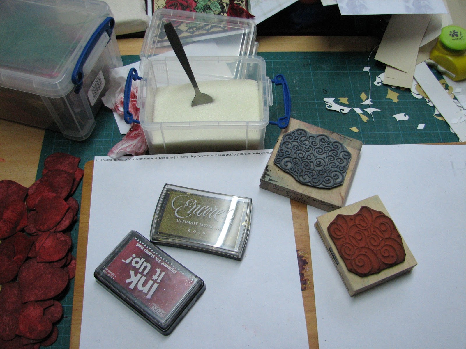
  The triple embossed hearts were made by inking first with a mix of Fired Brick, Barn Door and Aged Mahogany Distress ink, then a few were stamped with a word stamp 'LOVE' before covering with Clear embossing ink.


 Sprinkled with UTEE, 3 layers, then some were overstamped with a swirl stamp and Gold Encore Ink.The INK IT UP Pad is my clear Embossing pad- It picked up red ink the first time I used it for this, so I keep it for Reds. These pads are really cheap- only a couple of pounds, so its no loss. The Really Useful Box with the spoon in it is my UTEE- I bought it off e-bay, loose in a bag- much cheaper than buying a branded jar.
They were attached with a few dabs of silicone glue.


For the base, I covered it in a pale gold paper stamped with a lovely Baroque style stamp, by Magenta, 26019-R.
This is the stamp, and this is what it looks like when stamped a number of times to make a larger sheet. Stamped in Gold Encore, and heat embossed with Gold detail powder.

The stopper part of the card was made by cutting a band of black paper which was punched along both sides with the Martha Stewart 'String Lace' Border punch, then a panel of cream card that had been stamped with Hero Arts 'Italian Poetry' , S1832, in Gold and heat embossed. The Valentine greeting was stamped & heat embossed  in Gold again on plain vellum, then matted onto black then burgundy card, held together with a gold heart brad either end.The panel was attached with foam pads.

As I had a few images, and quite a lot of hearts, I made up some more panels, as I think this will come in handy for Weddings/Engagements/Anniversaries.


Friday, 7 January 2011

Collage Art

The main image is Illuminata, by Inkadinkado, stamped in black versafine onto cream linen card, then green, red & ochre inks  added with a stencil brush. The card base was cut to 15 cm square, and a sheet from the Kay & Co Lifes Journey pad torn and added to the left side. The image was matted onto dark green card and trimmed with a deckle edge blade then mounted partially over the torn paper. The letter A was die cut and overstamped with the same stamp, and inked in the same way. This was then triple embossed and left to cool. The word stamp from Winter Wonderland Plate 1, from Paper Artsy, was stamped in Gold Brilliance ink in the top right , then heat embossed with clear powder. The letter was fixed in place with Pop-up Glue dots. Live Well Laugh Often, Love Much was stamped in Espresso ink down the left, and some narrow brown & green ribbon tied around the spine.

Sunday, 14 November 2010

Birthday Knight

For this I took a piece of slightly textured cream paper, and stamped the large wording from the Elusive Images Medieval Heraldry u/m sheet at the top in Staz-on Timber Brown.I stamped this twice, one next to the other. Below this is stamped the script from Elusive Images Scripts & Timepieces u/m plate, also in Timber brown.This was stamped three times down the length of the paper below each of the large words. Over this I stamped the crowns and shield from the Heraldry plate. The shield was stamped in Adirondack Red Pepper, the crowns in Espresso, both second impressions.Tear  the paper at roughly 8 cm wide down its length.  I then used a colour duster to add some Terracotta ink in patches lightly over the design. I stamped the Knight in Copper Pigment ink,(Ink It Up) onto some cream hammer card and embossed with Stampendous Copper Detail powder.The sentiment was also stamped & embossed the same way. Cuttlebug folder 'Forest Branches' was used on a sheet of gold card cut to the width of the embossing folder, but twice the length. Because of the type of pattern, you can emboss half the card, then turn your card round and emboss the other half, just line up the pattern you have already embossed to the bottom of the folder.Trim down the image and matt onto black card, then onto the embossed card, leaving a wide border. Repeat with the sentiment, not leaving so much of a gold border. Black card was cut and folded to make a blank 10 1/2 cm x 20cm. The stamped script paper was then attached to the left side of the card blank with about 1cm folder around the back. The Knight was mounted with foam pads to the right hand side, and the sentiment added to the bottom. Red & Gold cord was wrapped around the spine and a red tassel added.
An End of an era

An end of an era

I write this with a broken heart, that only time can heal My beautiful, wonderful wifelet Shaz (Silverwolf) passed away peacefully in the ea...