A warm welcome to all my visitors,

Thank you for taking the time to come and look at my blog, I really do appreciate it. I would love you to leave me a comment, even if it’s just to say Hi. It means I can come visit you!

All my designs are original, so copyrighted to me. If I have been inspired by someone elses work, I have named them in the post, and where able, I have provided a link.

Please feel free to use my designs for inspiration, I just ask you to credit me, and provide a link back to my blog.

Thanks, Shaz XX

Showing posts with label masking. Show all posts

Saturday, 25 February 2017

Card for a New Home.

Right,I made this card a few weeks ago, and with waiting for it to arrive, then going into hospital, I've just realised that I hadn't blogged it.

The main stamp is by Hobby Art, from a set called 'Hares'. We spotted this at The Happy Stampers Festival last year, and as Doug pointed out, it would be perfect for anything for LLJ, as she is known for her love of Hares. So when Jan announced they were moving to Wales, and that they had a date for moving in, I remembered this stamp set.
This is the journal I was trying out some scenes using Card-io stamps in a while back, and I can't figure why I've never done this before, instead of winging it and hoping for the best. I've always got a stack of scrap paper under my work, and have occasionally done a test imprint on that, but never tried figuring out placement and colour.
 Anyhow, first off I stamped him in black, then built up the grasses around him using an assortment of green dye inkpads, and some stamps from an Inkylicious set called 'Essential Grasses'. Which it is, I think. A great selection of types of grass.


I didn't think I liked the black version, so instead tried it in Archival Rich Cocoa, which is what I went with for the card.
 When I stamped him onto the card base, I also stamped another onto Post-its, so I could mask him when I wanted to add the sky.
 The hare was coloured with Distress Markers in Antique Linen, and Walnut stain, using a waterbrush to drag the colour.
Bit of a jump here to the finished scene, when I realised I'd forgotten to take any 'in the process' pictures!
 I stamped the hare in Archival Rich Cocoa, then the grasses surrounding him in Adirondack Meadow and Lettuce.
 Tearing some scrap paper into hill shapes, I used a soft brush to create the hills with the Adirondack greens again.
Using Adirondack Sunshine Yellow and Sunset Orange, along with a dry baby wipe, I created a sunrise behind the hills, then put the mask over the hare.
Again using a soft brush I applied Adirondack Stonewashed all over the sky area, then added Sailboat Blue onto the upper portion of the sky, to get a sort of mottled look.
 A portion of fencing from another Hobby Art set was stamped in Archival Black onto one hilltop, then an Inkylicious Flock of Birds, and a butterfly added.


 The corners were rounded off- this little rounder from X-Cut is actually really good, better than other cheap ones I've had. I do have the Corner Chompers, but this one was handy.

 I matted the image onto dark blue cardstock, then rounded those corners too.
 Next it needed a sentiment, and one of the Phill Martin sets I've bought recently, Mini Baroque Occasions Set, has a New Home one in it.
 That was stamped in Archival Cobalt in the upper left of the scene.
I mounted the image onto a 7" square card base, then tied a blue and white spotted chiffon ribbon along the bottom.
 And then it was done.

Stamps Used:
 Hobby Art, March Hares
Hobby Art, Woodland Glade( Hillside fence)
Inkylicious, Essential Grasses
Inkylicious Take Flight( lots of bird flocks)
Inkylicious Playful Cats ( Butterfly)
 Phill Martin Mini Baroque Occasions Sentiment Set.


Sunday, 23 October 2016

Birthday Card-io for a change!

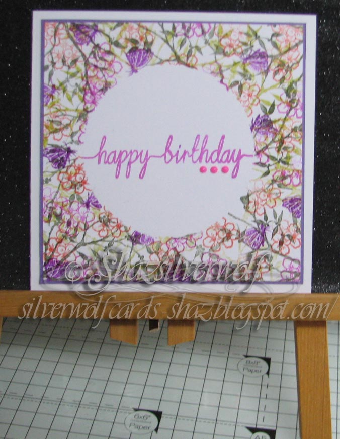
Following on from yesterdays Christmas Card-io cards, I thought the same design would make some useful birthday cards too.


So now I have 6 birthday cards to add to my stash.


A number of different Card-io/Majestix stamps were used to make these, but they all started out with some foliage being stamped first in an assortment of Adirondack and Versafine Greens.


I made sure to use plain stamping card this time around, and it worked as I wanted.

In the main, the foliage stamps are from these sets: Greenery 1, Summer Wreath and Oriental Blossom.
 I made sure to leave plenty of white space too.


The flowers on this one are from a set called Summer Meadow. Stamped in Adirondack Red Pepper and Cranberry.
All the floral elements in the cards were heat embossed with Clear Detail Powder, and the greenery had dried out so no powder stuck to it.


The same flower set used here, this time in Versafine Blue Lagoon and Adirondack Sail Boat Blue.


Here we have Gerbera Garden, using Adirondack Purple Twilight and Eggplant.The little bee is also part of the set, and was stamped in Archival Coffee, then I added a little pale orange with a Promarker.


The stamp set in this one is called Oopsy Daisy, with the two sizes of daisy stamped in both Adirondack Sunshine Yellow and Sunset Orange.
 The little blue dragonfly is from an RST set called Dragonflies at Dusk.


This one has stamps from another RST set called Triple Floral Dragonfly and a butterfly from Begonia garden. Inks used were Adirondack Mountain Rose, Pink Sherbet and Purple Twilight.


 Final card is stamped using Seasonal Rose, in Adirondack Red Pepper and Purple Twilight.


The birthday greeting is a Clarity stamp, from the set called Line Sentiments No.1. I used a matching ink from the flower colours to stamp it in, and placed the outer mask left from cutting out the circle to protect the design.


The selection of inkpads I was working from.


All six fronts mounted onto card bases, 5"x5".

Finishing touch was three half pearls in toning colours just below the sentiment.


Wednesday, 24 February 2016

WOYWW #351

A bit of a mess, to be honest with you. I had a few projects on the go at the same time, is my excuse.Partly the fault of getting stuff out of my UFO box. Plus I been trying to finish the Christmas Cards in the post below.I came across the Indigo Blu Blazing Poppies that I stamped out, possibly around this time last year.One set was coloured blue, which you can see on the right hand side. The other set only had a couple of flowers coloured, in shades of red. As you can see from the blue ones, I've also added some shading with Distress Inks.I'll do the same with the red ones, probably using brown shades.
 There are also some Toadstools, (Lavinia stamps), coloured with H2O's (blue & purple), and Distress Markers (red & yellow). A partly finished card at the back, the woodgrain  ( Stampin Up) with the toadstools.An assortment of inkpads, some Tombow Multi glue,acrylic blocks, (used for weighting down the toadstools), the blue parts of the card drying, after having Black Diamond Stickles added to the centres. The masks for the Poppies- I usually stamp on the top sheet, then peel off half a dozen sheets before cutting out, that way I always have spares. So that's mine, now lets all see yours. I'm off to join up with everyone at Julias, The Stamping Ground.


Sunday, 7 February 2016

Yet another set of Christmas Cards.


So it's yet another set of Christmas Cards, 2 in each colourway, so 4 cards altogether.
 For starters, I masked off  the centre section of a piece of square card, roughly 5"x5", using some torn copy paper.  For the Blue and purple card I used Broken China, Tumbled Glass & Mermaid Lagoon blue D I's, with Dusty Concord and Shaded Lilac purples to sponge between the torn edges of the copy paper.
These were left to dry out thoroughly, as I wanted to heat emboss the lettering, but didn't want the Embossing Powder to stick to the sponging as well.
For the red/green card, it was Shabby Shutters and Mowed Lawn, along with  Candied Apple and Festive Berries.
  
 The Christmas Words stamp is by Visible Image, and on the blue/purple card I used Salty Ocean to stamp with. I generally find on all but the most porous of cardstocks, Distress Inks are wet enough to emboss with, and if in any doubt, I tap clear embossing ink on the stamp first, then the coloured ink, and that works just fine. Barn Door was used on the red/green base.
In both cases, the masks were replaced so the word stamping was only visible on the sponged areas.
 Both were heat embossed using WOW! Clear Hologram Sparkle Embossing Glitter. They were now matted onto a matching cardstock, then attached to the card front with DST.
 I'd cut some Christmas trees out, using the Tim Holtz Woodlands die set, and one of these was added to each card front with a Zig glue pen. I lay an acrylic block on top of each, and left them to set overnight.


The snow effect on the branches was created with White Opal Liquid Pearls, with Glamour Dust glitter sprinkled over the top.
Final addition was another Tim Holtz die, Holiday Words Script 1, using Merry Christmas cut from white card for a white on white look.
 I think the Snow Words stamp has been retired now, but you could substitute any words stamp, or indeed use a few small stamps, mixed with some snowflake stamps.
 You could even use the words die to cut some words from fun foam and make your own word stamp- just remember to cut them out back to front.


So, I'm now up to 21 cards finished, and I have the fronts for another 10 on my desk.


Saturday, 27 December 2014

Favourites of 2014

Just browsing, as you do, and I saw a post from last year with favourite projects of the year, so as I've been very lacking on the crafting front lately, I thought I'd have a look back at my crafting year again this year. I've not just concentrated on finished cards this year, but also on some techniques I've really enjoyed trying out. Possibly a good call, as I seem to have so many UFO's about, its ridiculous!
 First card I picked this year,was one I did for a guest DT spot on Chocolate Baroque.


Put myself on the spot by colouring with Promarkers, and I'd just started playing with gilding flakes, so added them in too.I made both backgrounds by sponging on Distress Inks, then second generation stamping images. Something again I hadn't done before, though admired it greatly wherever I'd seen it.


Second card used sponging again, this time with another technique I'd finally got around to trying out this year- Resist Stamping. It only uses two stamps- both from Visible Image, Love with your Heart phrase and Grunge Flourish. The flourish was randomly stamped around the edges of the large square in white, and heat embossed in white powder. DI in Salty Ocean and Dusty Concord sponged over the top. On the small square the phrase was treated the same way, then I overstamped the flourish in Adirondack Denim. The flowers are called Delicate Asters, a Spellbinders/Heartfelt creations die, that looks gorgeous, but requires a ridiculous amount of patience to get good cuts!


The Resist Embossing technique is one I played with quite a lot over the year,  you can get some beautiful effects just by changing the sponging colours, and its so simple. What's not to like? I did the panels on a separate sheet of card, so the base card didn't buckle when I heated it, and just trimmed down to the height of my card base. Still pretty CAS, almost one layer cards though.


I stamped the ladybirds in black this time, and did mask them off for the sponging, and the overstamping with the fabulous Water Droplets stamp from Ryn, which incidentally can now be bought as part of an unmounted sheet available from Oyster Stamps. The cards made doing this technique, also led me to another card making discovery, for using up the offcuts, and the stuff that didn't come out too well.


Punch/cut down into small squares and mount in a grid system! The colours and stamps pull the whole thing together, and you get a bunch of cards in a few minutes.


It was definitely all about playing with the techniques this year, and one I found on Pinterest really grabbed me, called 'Northern Lights'. Just so simple, sponging on streaks of colour, letting them overlap and blend together, then finally bringing in a darker tone over them. Add your images, maybe a little colour to areas of the image, and you're done.


This was the start, with the basic sponged colours, and the overstamped images.


Same piece after the brightness has been toned down the addition of extra blue. All it needs now is some greys/browns adding into the rocks to tone that down, and its good to go.


Final one, just to show you don't have to get fancy to get awesome! Stamped in black on white, then matted onto black card leaving a really thin edge. To get the embossed oblong, I lay the stamped piece on the inside of the card front, and just lightly drew around each corner with a pencil. Then I marked about 1/2" away from those lines, and lightly pencilled in the oblong. Scored the lines on a scoreboard, then rubbed out the pencil marks.

So thats what I've enjoyed doing in 2014- heres to another year, and hopefully a lot more creativity on my part next year!

Monday, 21 April 2014

Building a whole scene using the Northern Lights technique.

As the previous project came out so well, I was intrigued to see if I could build up a whole scene with a group of stamps and still using the Northern Lights technique for the sky. I figured if I used some masking, it should work ok. I have to admit, I'm loving this method- even I think this sky is stunning!


The stamp positioner came out for this- I have a phobia about not matching the stamps up quite right. I used Versafine on the positioner plate, but Staz-on for the actual stamping. I used to stamp onto the plate with Staz-on, then discovered it was that that turned my plate all cloudy.  Having stamped the mountains in place, I placed Lakeside Cove below them then masked the mountains to stamp Star Birth over the top.This was the completed scene, before any sponging.


I put the mask back in place to begin the sponging- I wanted the colour to reflect in the water, but not be visible through the  mountains.


I started with Mustard Seed again, but this time I was a little more free-form in how I added it, not just in straight lines.


  I sponged the sky, then added some streaks to the water area, with a few dabs onto the rocks.


After the Mustard Seed came Adirondack Citrus, followed by Sailboat Blue.


Finally some Dusty Concord, then the mask was removed from the mountains.


Now I began adding Blues to the water area, Sailboat Blue and Denim Adirondacks.


Latte and Slate were added to the rocks.

To colour the mountains, I dabbed in some Citrus and Mustard Seed lightly, then added Slate over the top, with finally a bit of Latte. A few stars were highlighted with a white gel pen.

I trimmed the edges of the image down, to remove the excess card, matted it onto black, then dark blue card.
I'm also entering this into the Craft a Scene Challenge for April, which is a Mountains and Hills theme.


Supplies:
 Adirondacks, Citrus, Sailboat Blue, Denim, Latte and Slate.
Distress Inks Mustard Seed, Dusty Concord.
 Staz-on Black
Sponges
 White gel pen
 Stampscapes stamps:
 Lakeside Cove, Rocky Peaks and Star Birth.

An End of an era

An end of an era

I write this with a broken heart, that only time can heal My beautiful, wonderful wifelet Shaz (Silverwolf) passed away peacefully in the ea...