Another week further into the year, and another WOYWW,hosted as always by our lovely leader, Julia, over at The Stamping Ground. And I'm sending Julia hugs, and hoping her poor eye is somewhat better by now.
On the desk, these dies from The Works. Great deal at the price, and although I had some I'd bought of the Dies from China, these go much bigger.
One niggle- why do die manufacturers stick them down with such ridiculously strong tape? The struggle to get them off without bending any, then you have to remove all the sticky residue from them.
Another die, bought from Joanna Sheene is a nice trailing ivy. Cuts beautifully, and that was only held down by a really light sticky stuff, which wiped straight off. So plus point to Joanna for that.
I've put it on my cutting mat so you can see the size.
I'd been going back to some of the stencils I did a few weeks ago, and it dawned on me I've been doing stencils, and die cut cards for weeks, and I haven't done any stamping. So I stamped out the Teasels stamp in white,to sponge some ink over. Then I wanted to add a dragonfly, and spotted The Dragonfly Flourish stamp, so did some of those too. I'll finish them off over the next few days, and get the cards posted up.
Talking of Teasels, did you know they were the inspiration behind Velcro? Some guy was struggling to get them off his sons coat and a lightbulb went off, and as they say, the rest is history.
Another stencil experiment, and I'll get these made up too, and explain how I ended up with the ones below. It all started with a card I saw on Pinterest, lol.
No idea where I'm going with these, hopefully inspiration will strike in the near future, or they'll find themselves in the UFO box, which is getting kinda full.
Quick mention, just over a week till Happy Stampers. Anyone else who is going, give us a shout, and we'll meet up. I know Neet ( Hickydorums) is going.
I finally have the date for my scan, it's a CT, not an MRI which is good, as they don't take as long. Scan is an Saturday, then we have a meeting with the Oncologist on the 5th of May for the results. Fingers crossed.
And finally, this:
Pages
A warm welcome to all my visitors,
Thank you for taking the time to come and look at my blog, I really do appreciate it. I would love you to leave me a comment, even if it’s just to say Hi. It means I can come visit you!
All my designs are original, so copyrighted to me. If I have been inspired by someone elses work, I have named them in the post, and where able, I have provided a link.
Please feel free to use my designs for inspiration, I just ask you to credit me, and provide a link back to my blog.
Thanks, Shaz XX
Showing posts with label Joanna Sheen. Show all posts
Wednesday, 26 April 2017
Monday, 29 April 2013
Asian Panels
Three more cards, this time using the glittered Asian Panels. This stamp is available from Non Sequiteur, which can be bought from De Stempelwinkel. It also used to be available on a plate from Tanda Stamps, but having just been looking, I see they are no longer trading.
I started off by matting the glitter panel onto some silver mirror paper, then onto Red glitter card.
I used an assortment of oriental papers, the one with the lettering is a print off a Joanna Sheene cd, and the one on the left, which is the same image as the panel, was from a block of Kimono papers, from Arts & Crafts Direct. I remember buying these from a Hobbycrafts NEC show, and having searched the Internet, they only seem to be on e-bay, with a few items of cardstock!
I added a triple embossed Kanji letter to one, and a Kanji letter stamped & heat embossed onto an alcohol ink background to the other two,with some cord wrapped around the spine as a final touch.The Kanji letters were bought a long time ago, and don’t seem to be available now, although Judikins do have 2 large Kanji cubes, and I’ve linked to that below.
Links for the products:
Samurai Plate 67, Non Sequiteur,De stempelwinkel
Kanji Cube 2
Kanji Cube 3, both at Blade Rubber Stamps.
Saturday, 4 February 2012
Craft A Scene- A Winters Scene
Hi folks, this is my first post for the Craft A Scene DT, and the brief was to create two pieces with a winters scene. The second one comes along on the 19th Feb.
After a few flicks through my Stampscapes stamps, I picked out the ones
I wanted to use, then had a long think about how to create a wintry
look, without just adding a load of snow. ( Which just so happens to be
falling outside right now!).
I was still struggling with how to look wintry, but decided to get started on the stamping, and hope for inspiration. This image very, very almost went into the bin- I had a complete disaster part way through- and the funny thing is, it was in the rescuing that I got my winter look.
I have quite a stack of brayered backgrounds, from when I was practising to get the hang of it, so I selected one that I thought could end up with the right look. It is a piece of Matt card, from Lavinia Stamps, brayered from the bottom with Stonewashed, Sailboat Blue & Denim Adirondack dye inks, and from the top down with Cool Peri, Purple Twilight, and a little Eggplant right at the top. Before brayering I added a circle punched from a post-it note to the upper half of the cardstock.
I used Versafine Onyx Black to stamp the images. Most of the elements of this picture come from Nature Sheet #6. I started with the Lakeside Cabin (147F) on the right, then stamped Lakeside Island (from Nature Sheet #4, The Lost Scapes) next to it, using a Stamp Positioner to marry them up. I placed them about 2/3 of the way down the card,just where the blue started to fade out. In the foreground I stamped Ledge (054F) twice, varying the angle slightly, then added Reeds Lge (068D) randomly. I used Water Pattern sm (231C) in the water area. Final stamp was Spooky Branch (273G) stamped reaching in to the picture on the left and upright on the right. You can see on the design sheet that the Ledge stamp is much larger than in my scene- I just used a small portion of it to give me a river/ lake bank. Equally, you can layer & stack it to give you a larger rocky area.
Having taken the design sheet out of my folder to scan & show you, I could see similarities in my scene to the image on the sheet.
So all was well up till now,
when I decided I ought to have a reflected moon in the water. Considered
a few options, and decided to try 'stamping' a moon shape in Brilliance
Moonlight White, using a round foam brush. My instant reaction was that
it looked awful- it didn't work at all. And that I had ruined what was a
promising picture to boot.I tried wiping the white ink off- that
smudged and looked even worse. Next I tried cleaning that area with a
baby wipe- now I had a patch with a different colour ink to the rest of
the image. So, as a last resort, and as I had given up any hope of this
image being usable anymore, I wiped over the whole image with the baby
wipe- I had black ink coming off the image, as well as the white!
Panic!!!! So now, completely stressed by everything going wrong, I
folded a piece of plain white copy paper in half, put the image between
the two layers, put a book on top of it (oh yes, it was curling up too!), put it to one side and went to cook tea.
When I went back to it the following evening, I had no expectations of it being any use, and fully expected to be throwing it away. However, as you can see, what the baby wipe did was take enough ink away to give me a misty, ghostly look- perfect for mist/fog falling over a lake in winter. Trust me folks, nobody was more surprised at this than me. I had gone from scrap to perfect by sheer fluke.
Which does go to show that you should
never consider anything past retrieving- no matter how bad things seem! I
must be mad, but I decided to push my luck a little further- I have
never used a white gel pen on images like this before, but I have loved
the effect when others have done it. I found out my White Gelly Roll
pen, only to discover it had dried up from lack of use! I have since
managed to get it working by dunking it it warm water, but I purchased a
new one from Joanna Sheen- which only took a couple of days to arrive,
and sat down to work. As you can see I outlined the edges of the islands
and added some white to the fir trees. I did the same with the Spooky
branches, Reeds and the Rocky Ledge. I used an Orange & Yellow gel
pen to add a little light to the cabin windows. Finally I added a few
squiggly white lines to simulate the moon in the water- very nervously, I
might add- then trimmed the image down and matted it onto black, then
onto dark purple cardstock.
For the base card, I folded an A4 piece of Gold card in half. The embossed background was made with a Cuttlebug folder, Snowflake. I cut two strips of white card the width of the folder, and almost twice as long, embossed the image once, then turned the white card around and embossed the other end. The two lengths were then joined together with sellotape on the back, and cut down to fit the front of the card. A strip of pale blue ribbon covers the join. Mounted the image to the front, and breathed a sigh of relief, lol.
I suppose this could be a Christmas card, which means I have actually managed to start them in January- so I only broke my New Years Resolution by a half (I wanted to do two Christmas cards a month).
I hope you will join us over at Craft a Scene, I am looking forward to seeing the other DT's take on the brief, and what you all come up with.
After a few flicks through my Stampscapes stamps, I picked out the ones
I wanted to use, then had a long think about how to create a wintry
look, without just adding a load of snow. ( Which just so happens to be
falling outside right now!).I was still struggling with how to look wintry, but decided to get started on the stamping, and hope for inspiration. This image very, very almost went into the bin- I had a complete disaster part way through- and the funny thing is, it was in the rescuing that I got my winter look.
I have quite a stack of brayered backgrounds, from when I was practising to get the hang of it, so I selected one that I thought could end up with the right look. It is a piece of Matt card, from Lavinia Stamps, brayered from the bottom with Stonewashed, Sailboat Blue & Denim Adirondack dye inks, and from the top down with Cool Peri, Purple Twilight, and a little Eggplant right at the top. Before brayering I added a circle punched from a post-it note to the upper half of the cardstock.
I used Versafine Onyx Black to stamp the images. Most of the elements of this picture come from Nature Sheet #6. I started with the Lakeside Cabin (147F) on the right, then stamped Lakeside Island (from Nature Sheet #4, The Lost Scapes) next to it, using a Stamp Positioner to marry them up. I placed them about 2/3 of the way down the card,just where the blue started to fade out. In the foreground I stamped Ledge (054F) twice, varying the angle slightly, then added Reeds Lge (068D) randomly. I used Water Pattern sm (231C) in the water area. Final stamp was Spooky Branch (273G) stamped reaching in to the picture on the left and upright on the right. You can see on the design sheet that the Ledge stamp is much larger than in my scene- I just used a small portion of it to give me a river/ lake bank. Equally, you can layer & stack it to give you a larger rocky area.
Having taken the design sheet out of my folder to scan & show you, I could see similarities in my scene to the image on the sheet.
So all was well up till now,
when I decided I ought to have a reflected moon in the water. Considered
a few options, and decided to try 'stamping' a moon shape in Brilliance
Moonlight White, using a round foam brush. My instant reaction was that
it looked awful- it didn't work at all. And that I had ruined what was a
promising picture to boot.I tried wiping the white ink off- that
smudged and looked even worse. Next I tried cleaning that area with a
baby wipe- now I had a patch with a different colour ink to the rest of
the image. So, as a last resort, and as I had given up any hope of this
image being usable anymore, I wiped over the whole image with the baby
wipe- I had black ink coming off the image, as well as the white!
Panic!!!! So now, completely stressed by everything going wrong, I
folded a piece of plain white copy paper in half, put the image between
the two layers, put a book on top of it (oh yes, it was curling up too!), put it to one side and went to cook tea.When I went back to it the following evening, I had no expectations of it being any use, and fully expected to be throwing it away. However, as you can see, what the baby wipe did was take enough ink away to give me a misty, ghostly look- perfect for mist/fog falling over a lake in winter. Trust me folks, nobody was more surprised at this than me. I had gone from scrap to perfect by sheer fluke.
![]() |
| The Lost Scapes #4 |
For the base card, I folded an A4 piece of Gold card in half. The embossed background was made with a Cuttlebug folder, Snowflake. I cut two strips of white card the width of the folder, and almost twice as long, embossed the image once, then turned the white card around and embossed the other end. The two lengths were then joined together with sellotape on the back, and cut down to fit the front of the card. A strip of pale blue ribbon covers the join. Mounted the image to the front, and breathed a sigh of relief, lol.
I suppose this could be a Christmas card, which means I have actually managed to start them in January- so I only broke my New Years Resolution by a half (I wanted to do two Christmas cards a month).
I hope you will join us over at Craft a Scene, I am looking forward to seeing the other DT's take on the brief, and what you all come up with.
Wednesday, 28 December 2011
Last couple of Christmas cards
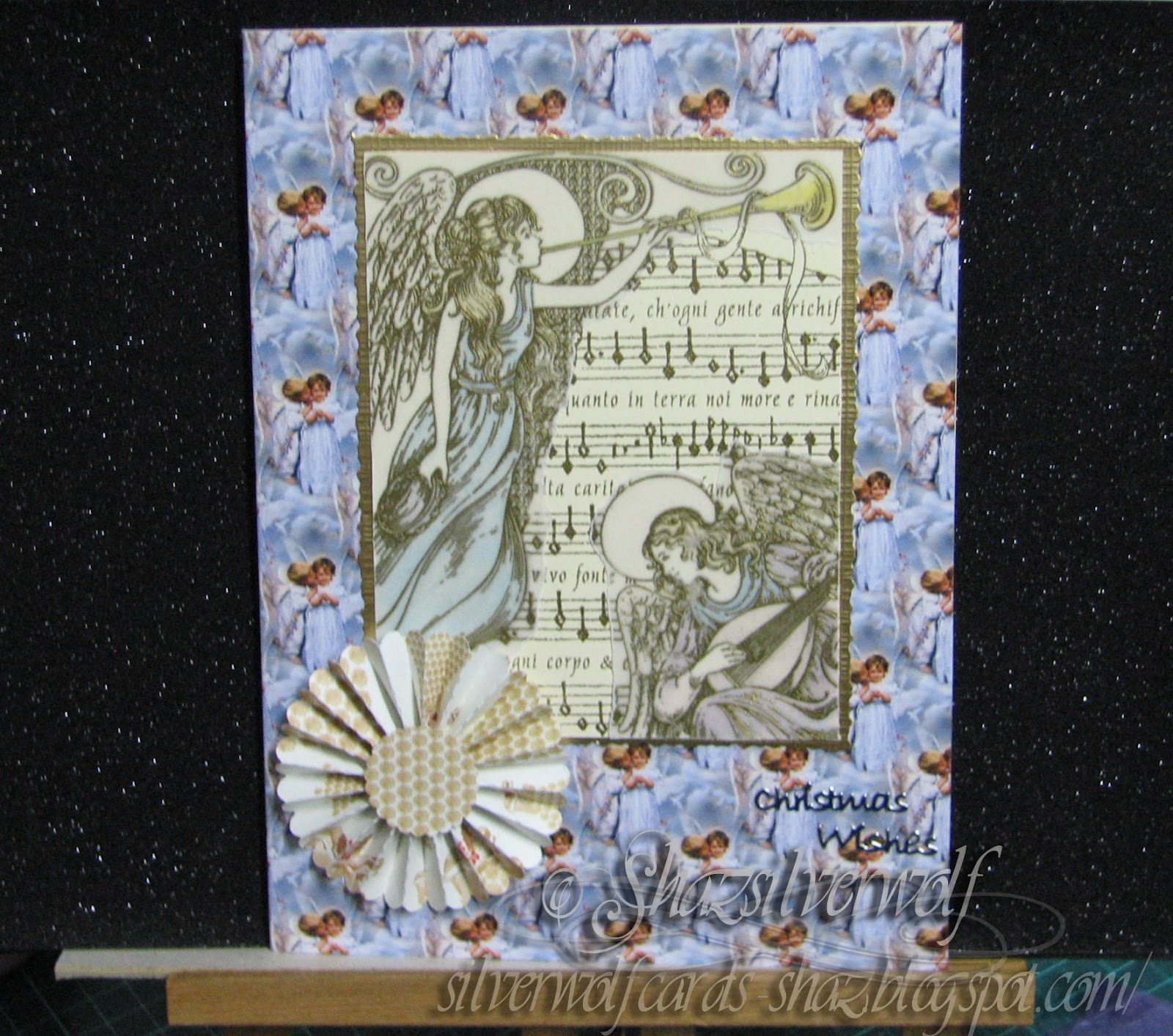
Both these cards use a stamp called Angel Chorus Collage, which I thought I had shown on here before, but apparently not. Its made by Rubber Stampede,and is available still, I found it here. I used a technique I saw done a long time ago, in a magazine, but I really can't remember who by. I stamped the image first on cream card and heat embossed with gold powder. I stamped & heat embossed in gold again onto plain vellum. I coloured the image on the card quite roughly with Promarkers- you don't need precise colouring, as the vellum softens the look of the colours.Then I tore around the angel images on the vellum, and placed them over the card versions, using some adhesive roller, the Stix2 one.I trimmed the images down and matted onto gold card. The backing paper on the card on the left is from a Joanna Sheen cd, and the other one is, I think, a Paper Pizzaz one, but I may be wrong. I have so many Christmas paper sheets I have had for years, I am trying to get some use from them, and stop hoarding, lol. Both have a rosette on them. I love those, I think I may end up doing rosettes to death if I'm not careful.You could also colour on the back of the vellum, and oil pastels would work well for that.I just liked the softness that the vellum gave over the card image.
Wednesday, 20 July 2011
WOYWW #111
using CI 185, from Crafty Individuals. The two images are all one stamp, I just split it into two images. The background was chalked with blues & greens, then overstamped using Versafine Black. They were stuck onto thick card, then triple embossed. You need to have a heavy weight cardstock for your card base for this, as the images are quite heavy when finished, I also thought after that they would make good fridge magnets, fixed to the card with re-positionable glue dots. I punched the border strips from blue paper for the wide one, and green for the narrow one. The butterflies were punched from some paper I had used to roll my brayer off onto! I overstamped it with a swirl stamp, and added a sparkle embossing powder, then punched out 9 butterflies. Each butterfly is 3 joined at the wings to get a 3-D effect. I have no idea where the message stamp came from, sorry.
Here is the same image, this time in its original form. I stamped onto an alcohol ink background, matted & layered onto black, then another alcohol ink sheet, then black again.
Next up is a purchase this week from Joanna Sheen, in her monthly e-mail was this item:on special offer at £1.49, instead of £1.99, for a pack of three, ultra-fine nib attachments for Promarkers.
I have tried for a close up here, so you can see the nib size, if you haven't seen them yet. You just clip them onto the existing nib, and you get an ultra fine line. Apparently it is best to buy 1 for each colour group, so you don't get ink crossover, and the recommendation seems to be to fit them to the widest nib. You can just unclip them anytime you want to use the wide end.Finally, some more wicked bargains from The Works. I just LOVE this place, I really do. Packs of 20 luggage tags,and packs of 30 miniature mirrors, all 99p each.
Ambrose is much better now, his 'eyebrow' has regrown, I shall post a picture later. Thanks to everyone for their good wishes to him :).
Now I am off to post this, and start my way around everyones desk. Happy Wednesday everyone, I shall get round everyone over the next few days.
Saturday, 8 January 2011
Oriental Butterflies

Two versions of the same stamp,which is available as part of a sheet from a couple of suppliers: Tanda Stamps,Far East set 1,where it is also available as a single stamp,and in both rubber or clear polymer, or from Non Sequiteur, Plate 67, Samurai Plate. Apart from the Butterfly block, both plates have different stamps on them. For both cards, the butterfly block was stamped in black ink, then heat embossed, onto alcohol ink backgrounds. The butterflies, flowers and leaves were all painted with H2O's.For the black & red card, the design was then cut into 8 tiles then remounted onto black card, trimmed then matted onto a second sheet of inked card. The sentiment was stamped onto a scrap, matted onto black card and fixed with foam pads.The butterfly embellishment was made using fusible fibres over the butterflies on the block, then cut out and mounted with silicone glue. An Oriental coin had a length of black/gold mizhuiki cord threaded through it, and was attached with silicone glue in the opposite corner.
This card is an example of how a card can change as you are constructing it, and of the benefits of putting it aside if you aren't happy- coming back to it later often helps. This one was originally cut into 4 horizontal panels, then re-matted onto black card. I wasn't sure about it, so left it and completed the blue one.When I looked at it again, I thought the 8 squares would work better, maybe because it seems to mimic the oriental Shoji panels?
For the blue card, the background is printed from a Joanna Sheen cd,Tales of the Orient.The kanji strip on the left was done in triple embossing, using black ink as the base. The sentiment was stamped onto a scrap of inked card, and small black brads added in the corners.
Sunday, 12 December 2010
Christmas 2010
These are the cards I have been working on lately. My mass produced batch for friends, workmates & my Beloved Husbands forum friends.The Stamp used is Santa Collage, by Rubber Stampede,3408F, and the vellums were stamped with a large u/m snowflakes stamp,origin unknown, sorry.It was stamped in clear embossing ink then embossed with Stampendous 'Stardust' powder.I used a mix of inks to stamp with: Encore silver, gold & metallic blue and Distress Cracked Sapphire, Aged Mahogany and Forest Moss.Each image was matted onto a matching foil paper, then onto white card embossed with the Snowflake Cuttlebug folder, then onto foil paper again. A matching narrow ribbon was wrapped around this, then a bow added.The sentiment was stamped in matching colours and matted onto foil. All elements were stuck down with silicone glue, due to the glittery vellum. Normal tabs don't always hold very well on this surface, but silicone glue will.

I trimmed the card front with a fancy edged blade, then stuck a matching strip of foil onto the rear of the card with DST.
I will be posting some pictures on how to batch-produce cards on my Tips & Techniques page during the Christmas break.

I trimmed the card front with a fancy edged blade, then stuck a matching strip of foil onto the rear of the card with DST. The insert is from a CD, called Thomas Kinkade, from Joanna Sheen
Thursday, 22 April 2010
Egyptian

Very simple, Torn piece of hieroglyph paper onto folded marble effect card. I found the Egyptian picture on the net, but there are a lot of similar ones on Joanna Sheens Egyptian Adventure CD.Cut around with pinking shears. The blue tile is Fimo,stamped with an egypt themed stamp, then rubbed with gold rub-on wax after baking,and stuck down with silicone glue.Small peel-off stuck onto blue glitter card also with a small amount of silicone glue, otherwise it won't stick.
Subscribe to:
Posts (Atom)
An End of an era
An end of an era
I write this with a broken heart, that only time can heal My beautiful, wonderful wifelet Shaz (Silverwolf) passed away peacefully in the ea...
-
A couple of weeks ago I mentioned that I had bought these, the new Tim Holtz Embossing Diffusers. You have probably seen, like me, the...
-
I take no credit for this discovery, a lady posted this on Pinterest HERE .Like any of us, I hate having to spend money on 'consumables...
-
This is the first of the batch of seven cards I made, thanks to some Pinterest inspiration. Here is the card that caught my eye,...