A warm welcome to all my visitors,

Thank you for taking the time to come and look at my blog, I really do appreciate it. I would love you to leave me a comment, even if it’s just to say Hi. It means I can come visit you!

All my designs are original, so copyrighted to me. If I have been inspired by someone elses work, I have named them in the post, and where able, I have provided a link.

Please feel free to use my designs for inspiration, I just ask you to credit me, and provide a link back to my blog.

Thanks, Shaz XX

Showing posts with label Memento. Show all posts

Monday, 2 March 2020

Christmas cards with Cardio stamps

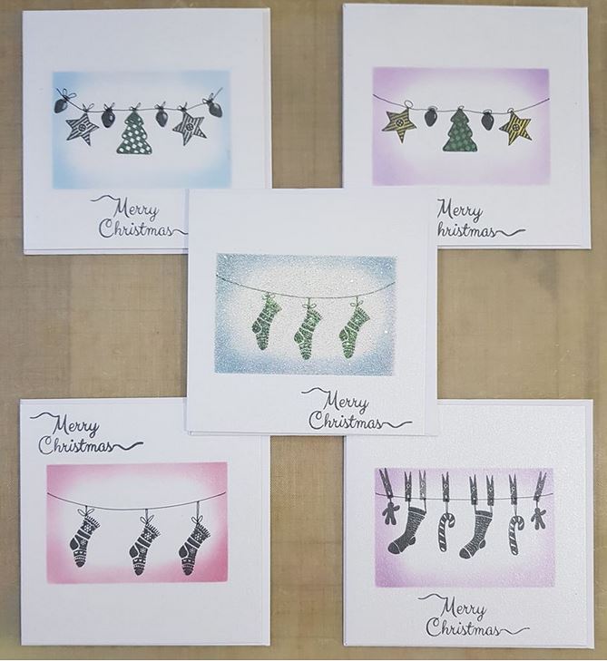
So, on a Fb group I'm part of, a lady had posted pics of some simple Christmas cards she'd made.  I asked if she'd mind me CASE-ing them, as the idea was great, and she very kindly said I could.
 I mixed it up a little, and created a Deckle edged oval, using my Silhouette Portait 2 to cut it out of  125 micron mylar. This is perfectly thick enough for inking through, but I'd suggest a thicker one if you wanted to use pastes/paints through.
 You can also die cut mylar, so you can create stencils that way too. I just didn't have a deckle edge oval die. I also cut deckle edged stencils in rectangles, circle & square for later use.


These were the cards created by Andrea Turner that inspired me.


Having taped my stencil down with Purple tape, I used a couple of the makeup style brushes to add colour.  In every case, I used 3 shades of Distress ink, a light over almost all the oval, a medium about an inch in all round,both using the larger brush, and finally the darkest shade just around the outer edge, using the small brush.


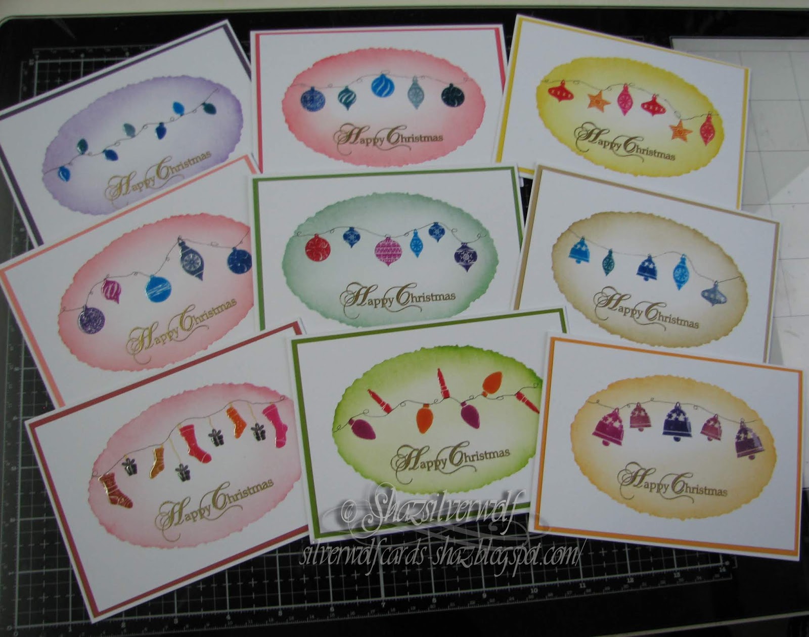
 All together, I made 15 backgrounds.
These are sized to fit 'notecard' size, made by folding an A5 piece of cardstock.


These are some of the Cardio/Majestix  stamps I used, and I ordered another couple with stockings and ornaments in, called Great Expectations (Stockings)  and Christmas Hang-ups.
 I did the stamping using various Memento inks, in the Dew Drop pad range. I also used my stamping platform for this, wisely as it turned out, as most needed to be double stamped. I left the drawing in of the strings till I'd finished them all, and used a fine micron pen for that.
 For a few I decided to stamp a swag across the panel, and I used a Lavinia £1 holly stamp for that.
For the holly I used Versafine Clair in Shady Lane, and sprinkled on a little sparkly EP and heat set.I'd added a small patch of yellow for the lantern light using a small round make up brush, then added Liquid Pearls for the holly berries.


 Next up, I stamped the greeting in Gold Encore Pigment ink, and heat set with Detail Gold Embossing powder. The sentiment comes from a Phill Martin set called Stately Christmas Sentiments.


All the images were matted onto a toning cardstock, leaving a narrow border.
 The final step was to add Glossy Accents to all of the ornaments, lanterns and stockings.

The Cardio/Majestix sets used were:
(Baubles) Zendangles,Bells & Baubles,Elegant Baubles, and one older Rubber Stamp Tapestry set called Embellished Holiday Wreath.

Then Christmas Hang ups, Great Expectations ( Stockings), Vintage Lights, and the smallest lantern from Christmas Scenery 3. There are two others in this pack, each slightly larger.



Wednesday, 26 February 2020

WOYWW #560- The Inking & Stamping Edition

 A desk with crafting happening too, for this weeks WOYWW over at The Stamping Ground, as always overseen by our much loved Hostess, Julia.
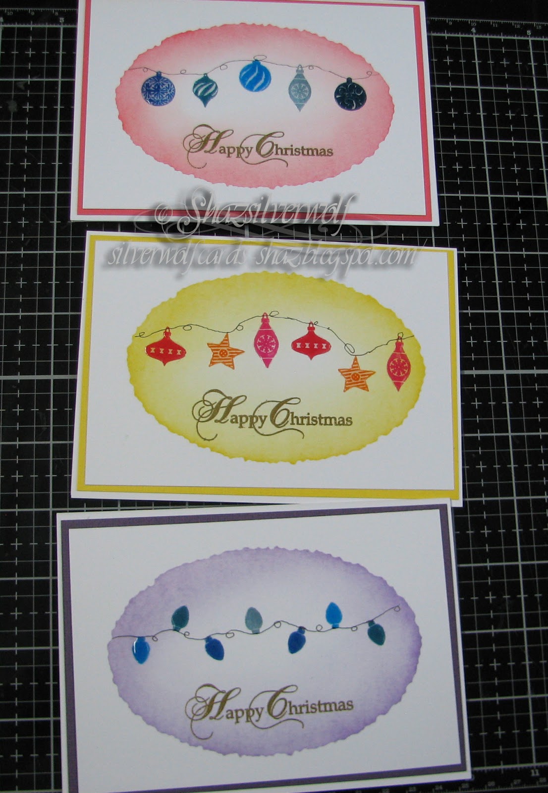
 I used one of those stencils from last week to make a batch of backgrounds, to CASE some cards.
These were all done with Distress Inks, and the 'make up style' brushes.
 They really are rather good for softer blending, although you can make them darker by adding more ink of course.


I have a couple of sets, bought from Amazon, around £10 a set, compared to £50ish for the branded 'craft' version. This is a set of assorted sizes, you can also get sets of 5 of just the larger ones for about £8.
 Just search for Toothbrush Style Make up Brushes. And the beauty is, you don't need a huge number of them, as you can just scrub the brush onto a Micro Fibre cloth and it will remove all the ink, without needing to wash or change to a different brush between colours.
 

The yellow one was done after the purple ones, as you can see no ink contamination.

The mixed size sets are really good, as you can use the smaller ones to add colour to smaller areas, which I did with the darker colour at the edges.


I've started stamping on some using lights & baubles from Cardio,and the Memento Dew Drop pads. Just have to draw in the strings, then I'm going to add some Glossy Accents over them.


These are the Cardio sets I'll be mainly using stamps from.


I also forget to mention last week that you don't necessarily need a digital cutter to make your own mylar stencils, you can die cut from them too, so you can create any shape stencil you like from your dies.

And thats my desk for this week. Which just leaves.....And Finally......

Thursday, 15 February 2018

First Shaker card, or a Comedy of Errors!

 A pretty accurate title as you will see as we go on.
I've long been meaning to have a go at a shaker card. Having seen them made in numerous crafting videos, I decided it looked pretty straightforward.
 And it is, as long as you remember one simple detail- forward planning!
 However, I think mine had gone off for a day trip somewhere, leaving me to fend for myself.


So, lets start. My base card was going to be an 8"x8" square, so I cut a separate sheet of Pearl White card to fit the front.  That is one thing I do remember- always measure your card base first before cutting.
 I've found the measurement given for card base packs seems to be the envelope dimensions, rather than the card, and it's annoying to go to assemble your card, only to find the front panel is bigger than the base.
 So, that bit done, I then decided I wanted to matt my white pearl onto a red cardstock, so cut the red, then trimmed down the white pearl cardstock. See,stage 1 and I'm already tripping over myself.  I used a Sizzix Heart Steel Rule die I've had for years to cut the centre heart out, after I'd marked the die position on the back of the card, along with corner to corner & side to side lines to make sure I got it as central as possible.

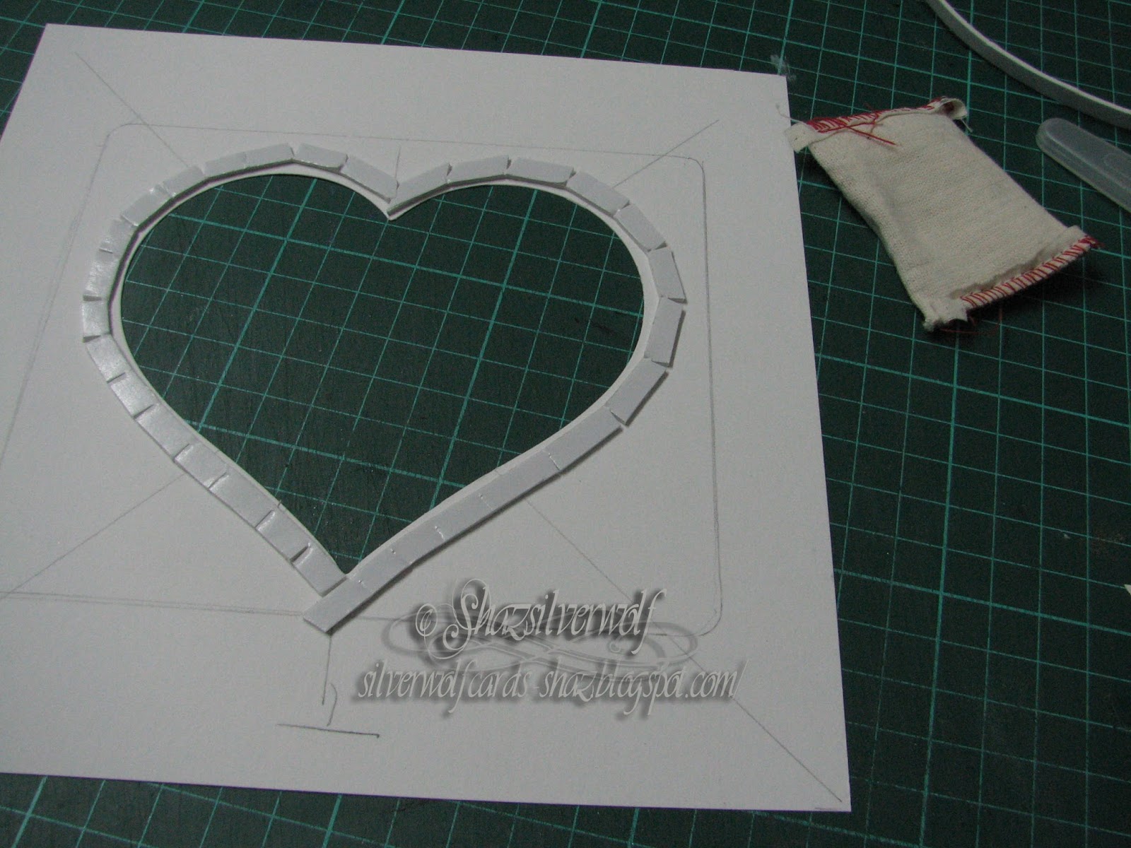
 Next the foam tape to raise the cut out. I have some rolls of foam tape- Poundland, 2 rolls and about 10 sheets of mid sized foam tabs for quid- I took a strip and cut it into 3 lengths. Then as I laid it down, I snipped at intervals to allow it to bend around the shape. I thought using the tape I didn't have to worry about any gaps between foam pop dots letting the filling leak out.By the way, the embossing bag was there as I used it to wipe over the inside edge of the foam tape to stop the filler from sticking to it.
 Amused myself that I thought of something that small, yet missed important stuff.😀


 So, I have one layer down on the reverse, and decide it needs two to give the filling enough room to move about. I'm halfway round with the second layer, when something occurs to me. I should have attached the plastic/acetate/film front to the reverse of the cardstock first!  Fortunately, I hadn't pressed the tape down firmly yet, so I carefully peeled it back off, and put to one side.
I cut a square from saved Embossing Folder packaging, and stuck that in place with DST.
 Then I put the foam tape back, on top of the plastic this time.

 So that was error number two so far- but I'm not done with them yet!
 Now we are onto the backing for the shaker, and in my Peel off stash, I remembered some holographic  peel off sheets.    Trimmed some off the sheet, and used it to cover some spare white card.


 Having a look in my stash, I sort out some tiny stars, some small and large hearts. All are those little bags of confetti for tables at parties. You can tell how long I've had some of them- that tiny hearts container used to hold camera film. Remember that?


Sprinkled some of each confetti into the opening. I can just imagine my face,had I still not realised about the plastic!


Peeled the backing tape off the top layer of the foam, and added a larger  foam tab to the four corners of the backing piece, then lay it on top.


Turned it over, and this is when I realised the next mistake I'd made. I intended to stamp the two sentiments in the top left & bottom right corners.

But now these two layers were together, I wasn't going to be able to stamp there, it wasn't a level enough base.
 I should have done the stamping after I'd cut out the heart, before I did anything else. So now we're onto Plan C. Or possibly D, I've lost track.


Finding a piece of the white pearl card, I stamped both sentiments, then trimmed down and matted onto the same red cardstock as the matt layer for the card, and mounted them with foam pads.
 The inkpad was Memento Lady Bug, and I heat embossed it with WOW! Sparkling Poinsettia.


Matted it onto the red layer with foam tabs, that attached it all to the card base with DST.

 As if the bling level wasn't high enough, I also added some acrylic hearts with Glossy Accents.


 Hubby loved it, sat shaking it for a while, trying to separate some of the larger hearts that had wedged on top of one another. Said it was a bit like those kiddies games where you have to tilt and turn them to get little balls into indentations, lol.


Stamps:
 I love you to the Moon & Back, Stampasaurus
Today Tomorrow, Inkylicious, available in 2 sizes, this is the larger one. The smaller one is about the same size as the one top left.


Thursday, 8 February 2018

A few Stampscapes Scenes.


 I have made about a dozen of these scenes, but will blog them in small batches,as it will be a photo heavy post!


Stampscapes Rubber stamps are exactly what they sound like- stamps that create scenes- landscapes/seascapes/skyscapes. This link goes to the makers US website- Kevin Nakagawa- and this next link goes to the UK supplier.
Visit Kevins website for loads of picture inspiration, and he has a massive list of You Tube videos on all aspects of scenic stamping.


The stamps blend together seamlessly, so masking isn't required, and they can be arranged and combined in an almost endless variety of scenes.

   For all my scenes, they were first stamped out in Black Dye ink, and the colour added later, using the Colorbox stylus tools and dye based inks. Adirondacks, Distress, Marvy and Memento were all used to colour them. You could also use sponges or daubers, even brushes to add your colour, I bought the Stylus tool & tips as that's what I'd watched Kevin using.


Starting with the first picture, the top left card was stamped out using the following stamps:
 144F, Cabin with Fence,
149F, Waterside Bluff, Right,
196F Pine Tree and
244E, Tree Cluster.

The cabin was stamped first, then directly below it the Waterside Bluff, R. This also comes in an opposite image, Waterside Bluff Left.
Following that, the Tall Pine on the left was added, then the 'Bushes' were stamped, using just the top portion of the Tree Cluster.
Although I said there was no need for masking, by using a torn piece of paper towel as a 'mask', then stamping the Tree Cluster with just an upper portion of the image above the top edge of the paper towel, treetops can become bushes, or tall trees made shorter, and appear to be growing out of the grass.
 The colour is added in layers, starting with the lightest value of colour, then moving up to a mid tone, then finally your darkest tone. 3 colour values are often all that is needed.The water only used 2 blue shades, the sky, 3. Moving on to browns for the cabin and rocky edge of the Bluff line.
 Followed up with green tones for the grass, the added in some meadow flowers using gel pens. You could of course use coloured inks to stamp out your scene.


The second scene, top right, picture 1, shows how you can combine different images.


 The stamps used here are:
359G, Snowy Creek, stamped out first. Although it's called Snowy Creek, it can just as easily become a creek surrounded by grass, simply by how it's coloured.
 
Next comes 144F, Cabin with Fence again. It becomes a totally different scene to the first one, just by changing out one stamp.


Next addition is 251C, Sedge Filler, which is stamped out on both banks, to turn it into a grassy meadow, rather than a snowy scene. There are a number of grass 'filler' stamps in the range, and really help to bring a scene to life.
Next the addition of some trees, again using 244E, Tree Cluster, and added in exactly the same way as for the first scene.


 Now the colour addition starts, and it is good to have some light- the white of the page- left in the sky, for a light source, and reflecting this on the ground/water in your scene.


Again, 3 values of blue were used in the sky and water. Then onto green for the grassy areas.
  A very pale green to start with, followed by a yellow green.


Then a slightly darker green was brought in,
 and then a quite dark one, all the time leaving some areas in the lighter shades, so that your scene has some depth.


 Finally some meadow flowers added again with gel pens, then a final bit of stamping, right at the front,068D, Reeds Large.


OK, final scene in this post. The longer scene uses a stamp called 049G, Lakeside Cove lge.
The image actually looks like this:
but I made it look the way it does by using a slightly longer piece of card,and not centring the image, but stamping them side by side. The 'Northern Lights' were created by streaking in some light green and purple/pink in the sky, then building up some blue layers on top. That was also reflected in the water. Brown added to the rocks, and stars created with white gel pen.

All the images were done on glossy cardstock, but matte coated works just as well. When the scenes were dry, they were sprayed with Artist Fixative, which helps to bring back the colour, as it does fade a little on drying.

All these scenes are now posted on my Stampscapes Gallery page, and all the stamps used in each image are listed next to the photo.

Saturday, 18 March 2017

White Inkpads- The never ending search!

Right, so I know I did this sort of thing a while ago, probably a couple of years now, and since then I've acquired a few new whites. As you do.
 This is by the way of a bit of a side project, as it started out that I was going to recreate the card I made with Pauline last week, then I looked into the Black Magic technique  on Pinterest, and realised that it can also be done with White Pigment Ink, so I thought I'd do a side by side comparison, to see which gave the best effect, Gesso v Pigment Ink.
 Then I needed to see which of my whites would give the best coverage on black, and here we are with a blog post!
When I did the last try out, I think the only pads I had were the Hampton Arts, Studio G and Brilliance, besides the despised Staz-On White Opaque, and I believe I also embossed them with white detail powder. These ones are not heat embossed, so the colour is as it comes from the inkpad.

So here they are, and I've made the image extra large, so you can see them clearly. I've also split them down into rows, with a few words for each.
Tims Picket Fence shows up remarkably well I thought, but the middle two, Do-Crafts Artiste Palette and Ink It Up left a very pale imprint. The Adirondack Snowcap also produced a good print- when I realised it had a plastic cover over the inkpad!😀😀
 On the next row, I thought only the Versacolor White gave a poor image. By the way, the Colourbox Frost White is a VERY juicy pad- I had to clean off the stamp and try again, so a very light hand when inking up with this one.😁
The final two, and I did squeeze these on to the bottom of the card, as I'd used an offcut, but wanted to get them all on the same base, for comparison.
 Both these inkpads produced a good image, in my opinion. I'd be happy with either one.
 Could well be a case here of getting what you pay for, as the two worst performing were also both at the bottom end of the price range on inkpads, just a couple of pounds each.
My top three would be Memento Luxe, Brilliance Moonlight White and Colorbox Frost White,followed by Picket Fence,Hampton Arts & Studio G. Snowcap from Adirondack would be next, along with Versacolor, and finally Artists Palette and Ink It Up.

 By the way, a tip I picked up from a forum: When using a White inkpad for something like the Bokeh technique, where you are adding white ink to a still damp inked background- smoosh your white inkpad onto your craft mat, or put a little reinker on your mat, if you have it. Then work from that, thus saving your precious white inkpad from getting stained.

An End of an era

An end of an era

I write this with a broken heart, that only time can heal My beautiful, wonderful wifelet Shaz (Silverwolf) passed away peacefully in the ea...