A warm welcome to all my visitors,

Thank you for taking the time to come and look at my blog, I really do appreciate it. I would love you to leave me a comment, even if it’s just to say Hi. It means I can come visit you!

All my designs are original, so copyrighted to me. If I have been inspired by someone elses work, I have named them in the post, and where able, I have provided a link.

Please feel free to use my designs for inspiration, I just ask you to credit me, and provide a link back to my blog.

Thanks, Shaz XX

Showing posts with label Dragonfly. Show all posts

Thursday, 14 April 2016

Ribbon Bow Die cuts to the rescue!

So, as I got to the end of the card I made yesterday, I had to hide a boo-boo with a paper bow. Which made me think that maybe I could rescue the ones with the dreaded embossing line across them. Only one way to find out.


As normal, I stacked up the white sheets and held them together with a bit of repositionable tape.
 The Cardio stamps used this time are called  Seasonal Rose, and again, Greenery No1. Adirondack inks used were Clover, Meadow and Lettuce for the greenery, with Wild Plum and Raspberry for the roses.


The Greenery set has a  corner stamp, which fitted nicely. I added to this with other stamps from the set.


 Once I had enough greenery, then I added a few roses. The set for these contains two different sizes of Rose, as well as a few twigs and branches.
 Added a few Dragonflies in blue.


Ready to matt the three layers. I chose a purple cardstock to matt these onto.


I shall mount the first two layers together, then put on the ribbon bow and see if I can hide the line.


 How much of a fluke is this? When I cut out  a whole bunch of ribbons and bows the other day, one I cut out was from a purple vellum. It sits nicely across the indent, is just long enough to cover the two layers, and get held down on the back with some DST.


Add the bow, held together and attached to the ribbon with small glue dots.


I'm not going to try stamping a greeting, I learnt that lesson already! So, a small silver peel off, coloured with these pens I picked up in Tesco years ago. Still going strong. The special 'peel off pens' I bought at the NEC years ago have long since given up the ghost.


And we're done. As this one was so successful, I shall be doing the same with the second one, but I'll go with a different colour scheme.

Triple Stamping & Embossing- and how to not get lines from the edge of a folder.


This is my triple stamped and embossed card, inspired by this one from Pinterest:


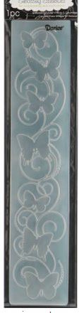
The embossing folder is by Darice,called Border Butterflies.
 There is another, called Butterfly Corner, which I think may have been the one used, but the effect is similar.

 I was going to use a 6x6" card base, so I worked out what sizes I needed for the embossed & stamped panels.


 This was  5 1/2 ,4 1/2 and 3 1/2" square. I cut the three pieces, layered them together with some repositional tape, and ran it through my Big Shot Pro.


However, things did not go totally according to plan.

I had a line from the edge of the folder across my card.

So,I Googled a bit, and tried one suggestion I found, which was to make shims to go alongside the folder. Doesn't work.


Same result- a bit fainter, but still clearly there. So I gave the matter some thought, and a bit more Googling. Seems to be a commonly asked question, and over on Splitcoast Stampers, I got pointed in the direction of the solution.


The lady on this blog, Indigo Inklings,explained how she had got rid of the lines from a border folder.
 What I needed was to emboss, but without applying pressure to the edges of the folder. Which means replacing the top acrylic sheet with something else, narrower than the folder. I cut  a piece of chipboard weight cardstock into 3 lengths, all just about a quarter of an inch narrower than the folder.


To stop them moving about, I taped them together.You may be able to see they are just a fraction narrower than the folder.


The three pieces of chipboard were the perfect substitution for  the normal acrylic block.


You can see, perfectly embossed, with no edge  lines.


Now we come to do some stamping. I'm using a mix of stamps, some from Cardio/Majestix, and some older ones I have from Rubber Stamp Tapestry. I also selected some inks to use- Meadow, Lettuce and Citrus for the foliage, Eggplant, Purple Twilight & Stonewashed for the flowers, all from Adirondack.


 I used a selection of Foliage stamps from the Summer Wreath set, and Greenery Set 1.

Then I added in some flowers,using the Adirondacks, then some dragonflies in Versafine Majestic Blue and Deep Lagoon.


The Dragonflies came from a Rubber Stamp Tapestry set called Dragonflies at Dusk.


 I finally added the Butterfly from the Summer Wreath set. With this bit done, it's time to separate the layers, and matt them onto a coloured cardstock.
I hadn't cut these yet, as I was waiting to see what I felt was the best colour to pick out the layers . I chose a darkish blue in the end, and these are all cut to be an 1/8 of an inch larger all round than the stamped piece, so they need to be 1/4" larger in total. So, that's 5 3/4" square for the first piece, 4 3/4" square for the


second, and 3 3/4" square for the final piece.
 Each piece is matted onto it's solid colour matt. Now to layer them back up again, and this is easy enough to eyeball it. By the way, this is easy to orient correctly, as only one corner is stamped, and the embossing only lines up one way. If you have an all over design, It is worth writing a 'T' for top on the rear top of each piece as you disassemble, the make the same note on the back of the solid colour matt.  It's surprising how hard it can be to line it all up again after if you don't keep track of which way is up! Now it's just a case of mounting this onto your card base, and you're done.
 You will notice my finished piece has a bow in the left hand corner.
That's because I attempted to stamp 'Birthday Wishes' after I'd matted it all up, and it went badly wrong. So the stamping is hidden behind a bow. However, not a total disaster, as it did make me think that maybe I could hide the line embossed across my first two trials behind a ribbon, so they may not be wasted yet, we shall see.


Monday, 29 February 2016

More Masterboards, and some Brusho ones too.


 As I said in the last post, I decided to try some masterboards using Distress Stains. I admit that generally I've bought the more vibrant, zingy colours, so I'm never going to get subtle backgrounds till I invest some more money in Tims offerings.


 Anyhow, the first one was streaked with Wild Honey, Squeezed Lemonade and Carved Pumpkin.

Then, flicking through my stencils folder I spotted this one, by Paper Artsy, which I was enabled into by Helen (Stamping By H) back last year. It looked the sort of thing that would be really useful at the time. I overstencilled by sponging on in Carved Pumpkin, then in Ripe Persimmon.


Setting that aside to dry, I started with Salty Ocean on the next one, followed by some Dusty Concord. I'd got into the stencilling now, so used two Tim Holtz stencils on this one, Mesh and Shattered, which I think looks just like cobwebs.


I used Seedless Preserves for the stencilling this time round.
Now I switched back to the DI pads, so I could get some lighter backgrounds, and the first one up I failed to photograph until I'd got to the stencilling bit, but it's shades of purple-Shaded Lilac, Dusty Concord and Wilted Violet. First stencil was Tim Holtz Honeycomb,inked in Wilted Violet.The flourishes stencil is called Mini Capricious, and the clocks stencil Mini Time Travel, both by The Crafters Workshop, both inked in Blueprint Sketch.
 The next stencil I'm using I hope you can see in the picture, is one of a variety of sized circles, which I cut on my Silhouette machine, from OHP film. This also got inked with Wilted Violet.


 For the next piece I went back to the leaves stencil,onto a background done with Squeezed Lemonade,Mustard Seed, Shabby Shutters and Twisted Citron.The leaves were stencilled first in Shabby Shutters, then in Wild Honey, and finally with a baby wipe through the stencil to remove some ink and give a ghosting effect.


Final sheet of Distress Backgrounds, and I used quite a lot of colours on this one. I went through all the pinks, just building up colour.


Then I brought in Picked Raspberry, Wilted Violet and Carved Pumpkin.


I started stencilling with Wilted Violet again, and the stencil is a Clarity stencil, a circle of stars and dots.I just used parts of the circle, and moved the stencil around to give me a scattering of stars. The branches, in Picked Raspberry, are from a stencil by Imagination Crafts, I think called Bird Houses.


Now the first ones had dried, I started adding some stamping. Using Candied Apples and Blueprint Sketch DI's, I stamped 3 different dragonflies over the orange background.


The green and yellow sheet had 3 different butterflies stamped in Lucky Clover and Cracked Pistachio.


As I'd stencilled what looked like cobwebs on this one, I continued the theme with a skull stamp ( Stamp Addicts Sheet, Skulltastic), a dancing skeleton,( Lost Coast Stamps), and a flight of birds from a Cherry Pie Artstamps sheet,Dark Boundaries. The skull was stamped in Blueprint Sketch DI, the rest in Seedless Preserves.


On this one I stamped a dandelion head from an Inkylicious set, called Make a Wish.The flock of birds stamp is also Inkylicious, a Twinchie stamp, both stamped in Seedless Preserves.


The stamping on this one was again Inkylicious stamps, a clocks set called Timepieces. I used Chipped Sapphire DI to stamp in.


So thats the DI pieces. Whilst I was making a mess, I thought I'd have another play with some Brusho's.


I was interested at first to see what other colours you get, when using a single colour group. This sheet only has blues on it, but you can clearly see some purples forming from the powder.


So I did the same with greens, and here there are yellows, oranges, reds and even some faint blues, just from green powders. The olive green did seem to burst into the widest range of colours.


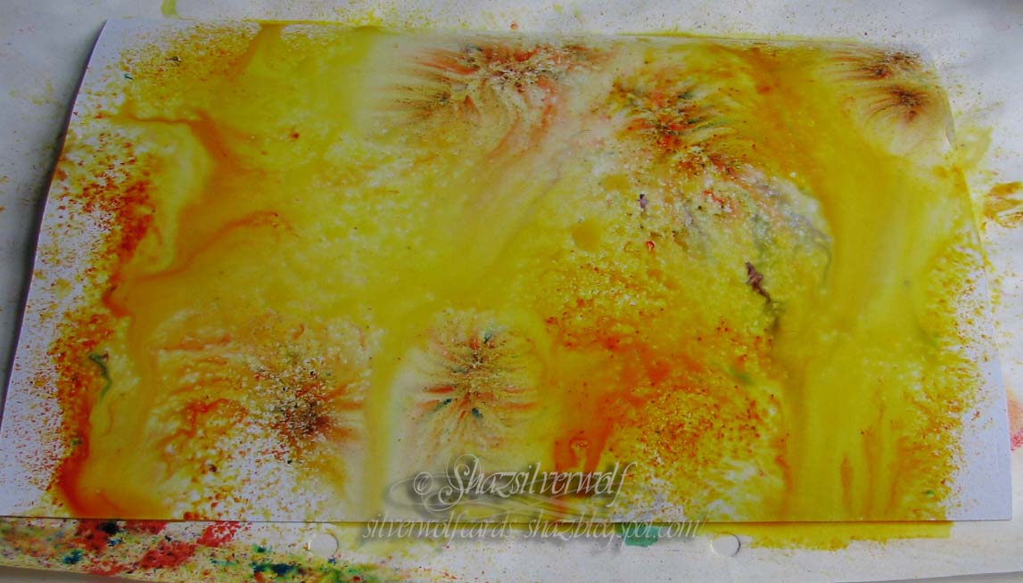
 Ditto with yellows, we have oranges and browns too.


In fact, reds seemed the only colours to stay true.


Then I started getting random- I love the almost organic shapes you get forming. This was water misted onto the paper first, then the powder sprinkled on.


This was powder first, then spritz.


 This one was lightly sprinkled with powder, then lightly misted.Less water gives you a more confined spread.


This one started out by being pressed onto the one directly above to mop up some of the water, than I added a few more powders.

An End of an era

An end of an era

I write this with a broken heart, that only time can heal My beautiful, wonderful wifelet Shaz (Silverwolf) passed away peacefully in the ea...