Happy WOYWW, pop over to Julia's blog at
The Stamping Ground to join in,if you are new to this. So here is my desk for today.

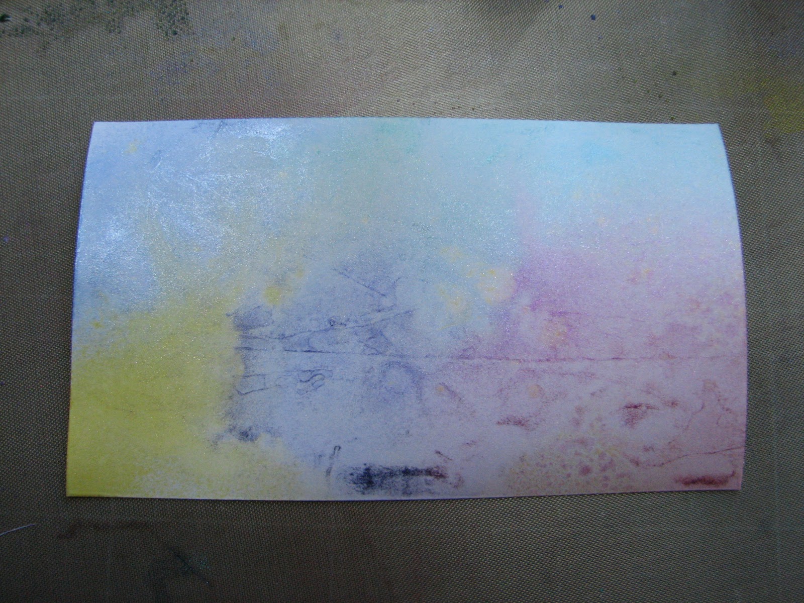
The stamps I have used are four Botanical plates, unmounted, and I have had them for a few years, and long since forgot where I got them from, sorry. A few months ago I made up some crackled background paper to use with stamping, and I thought the botanicals would work well. I used watercolour paper, I bought an A3 pad from The Works (Yes, I know I shop there a lot!). The first coat of acrylic was a pale yellow/ brown, which I got by mixing white and Wheat. This was coated with a layer of crackle medium, then an off-white top coat. I stamped in a mix of inks, Versafine Sepia & Olympia Green, Adirondack Espresso, and Memento Tuxedo Black.Just staring the painting process now, using H2O's, will be trying Promarkers, and maybe watercolours on some of them.
As I haven't got any finished projects, and haven't been shopping anywhere to find any bargains, I thought I would share one of my absolute favourite craft books with you this week.I'm sure I'm not the only one who has occasionally ordered a book, only to get it & open it and think, hmmm is that it? Wish I hadn't bothered.
Well this book definitely does NOT fall into that category.
The title is
Paper Transformed, A Handbook of Surface Design, Recipes & Creative Paper Projects, By Julia Andrus. The link will take you to it on Amazon.It contains an amazing number of techniques for ways to transform paper with paint, ink, pearls, glosses, glazes- you name it, its here.
All the finishes and effects are displayed as tags, this one shows 'cosmos paper'-simply put, a tag is inked, covered in Perfect Medium (or Versamark works the same) , and coated with UTEE 3 times. Then coat once more with medium/versamark, lightly brush on Perfect Pearls/ Mica Powders. Then sprinkle with UTEE again, and start heating from a distance, so it doesn't blow away. As it melts, bring the gun closer.The micas begin to sink into the UTEE. I have done the three first layers, then coated again with Versamark, flicked on some mica powders, sprinkled with UTEE and heated. This worked the same, and I didn't have to worry about the UTEE blowing away.
 |
| A page on overstamping, gilding and crackle effect. |
There are pages on ageing, distressing and creating fake metal looks and effects, like rust/verdigris etc.
 |
| Batik effect |
The last half of the book has projects using the effects & techniques shown in the first half of the book..
The book is 174 pages long, and every page is a delight.
There is something for everyone, and all the techniques are explained clearly in at most half a dozen steps, so they are not difficult, but they ARE all stunning. Even the cover is full of scrumptious looking projects, and unlike some, they are not just showing the best from the book on the cover!
This is one book that comes off the shelf regularly, and I guarantee it is an investment you will not regret.( You could always put it on your Birthday wish list, lol.)It costs just under a tenner on Amazon,which seems the average price. By the way,
Julia Andrus has her own website,which I found earlier, and it looks stuffed to the gills with wonderful ideas.


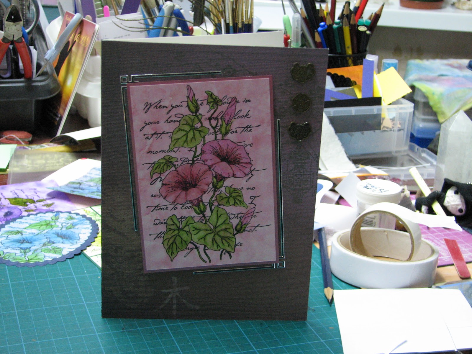
 The main image
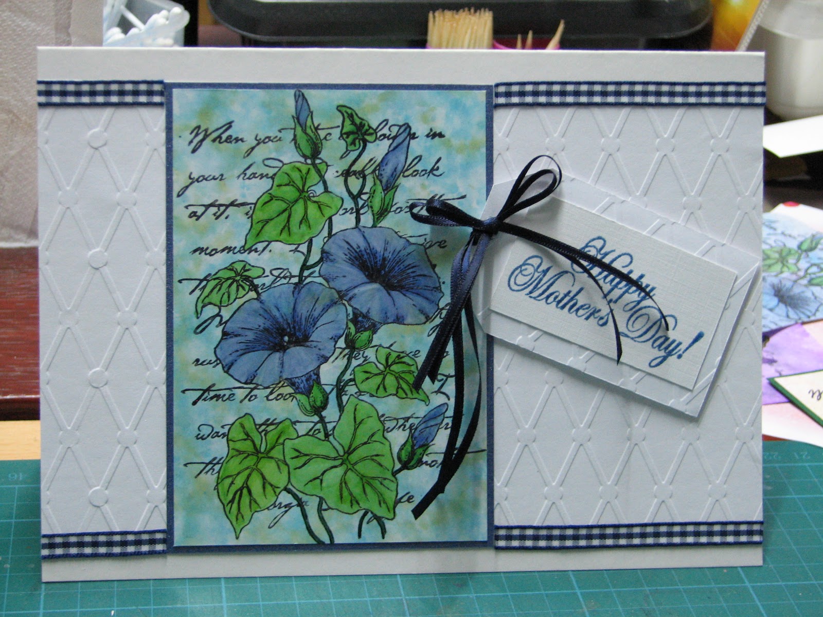