A warm welcome to all my visitors,

Thank you for taking the time to come and look at my blog, I really do appreciate it. I would love you to leave me a comment, even if it’s just to say Hi. It means I can come visit you!

All my designs are original, so copyrighted to me. If I have been inspired by someone elses work, I have named them in the post, and where able, I have provided a link.

Please feel free to use my designs for inspiration, I just ask you to credit me, and provide a link back to my blog.

Thanks, Shaz XX

Showing posts with label Blue. Show all posts

Friday, 6 April 2018

Retiform Technique Cards

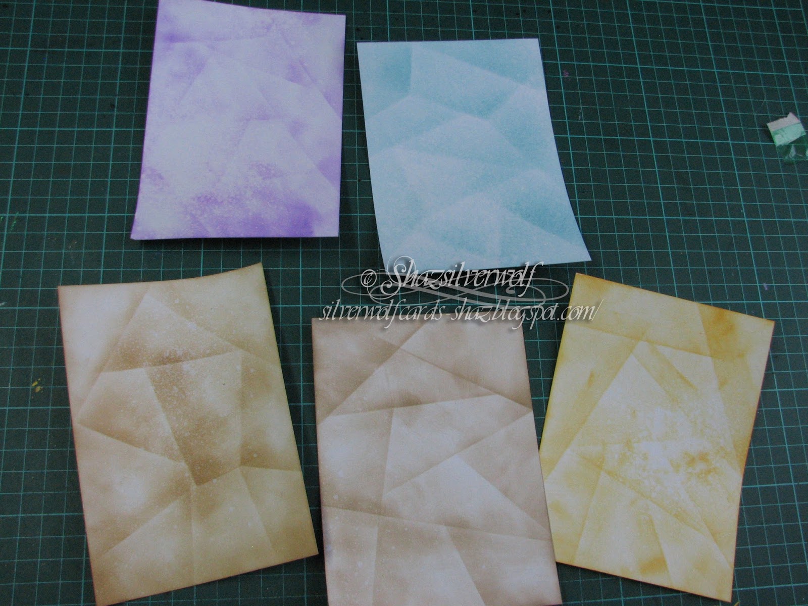
 I came across this technique on You Tube, and there were some really cool cards made with it. I ended up with 4 cards from it, I did make 5 backgrounds, but completely stuffed up the stamping on the first one!


It's very simple, you just need Post-its, dye inks and applicators, and a selection of stamps of a suitable size, and if definitely works best if you have a theme, as this unifies the whole piece.


 The idea is that you mask off a section using Post-its, then sponge ink into that section. Then you move the Post-it to cover the inked section and add another Post-it or two to create another section, and repeat the sponging. You carry on this way until you've created sections all down your cardstock.
 It works best if you vary the size and shape of your sections too, along with the depth of colour sponged on.
For the first one I used Card-io/Majestix stamps, which are great as they are the right sort of size to fill the spaces.. You can of course use partial images, which I've done with the others, and would also be a great way of making use of the smaller 'filler' stamps that are in many sets.
The sets used here are:
Greenery 1, Backyard Blooms( Spider web & spider, and some of the greenery), Pottery petites( the small flowers on the Wheelbarrow),Oriental Whispers( Branch Bottom Right),Perfect Patch( Wheelbarrow & Wellies),Seasonal Rose,Pleasant pastures( Toadstools), Dragonfly Garden, and Feathered Friends for the birds. The blank space has been left for a quote/ sentiment.
I used DI  Old Paper, and an assortment of Versafine inks for the stamping.


I went with a sea/boat theme for the blue one.
Some of these stamps came from a sheet bought from the USA many years ago, and I cannot remember where I got it. Others were 'bargain bin' stamps bought at a stamp show. I believe the quote was a magazine freebie again a few years ago.
 The ink was Tumbled Glass and Broken China Distress ink, the stamping done with Archival Cobalt.


 I used Wilted Violet Distress Oxide for the sponging on this one, and Versafine Majestic Purple for the stamping.
 The stamps are: Visible Image, 'Music Speaks, Smiley Faces and Music on World off.
The 'Rock Star',Skull Border, Drum Kit,Winged Skull and Guitar lower right are from an Inkadinkado set called 'You Rock'.
Guitar top right is from a company called Dimension, who I think are no longer trading.
The angel & guitar is from a magazine freebie sheet, as were the music notes.


All 3 of these would make good masculine cards, I think, indeed the technique itself works well for them.


Final one used Distress Oxide Wild Honey for the sponging.
 There are two stamp sets used, the stylised cats are a set from a company called Inkwell Stamps, a UK company, as is the sentiment.
 The other cats, as well as the Fish bowl, wool ball, paw prints and mouse come from a  Hobby Art set called Catz. They were stamped in Versafine Vintage Sepia.


The four finished pieces.


All four were matted and layered with toning cardstock, then mounted onto card bases- 5x7- also in coloured cardstock.


The quote on the garden one is from a Tim Holtz clear stamp set, and is smaller than the rubber version.
 Not adding sentiments to the other 2, that way I have more latitude when I come to use them.
 The blue and the brown ones would be suitable for a Retirement card, as well as a Birthday, for instance.

Thursday, 29 September 2016

Honey Doo Cards #2

The second half of the batch started the other day.

   No step by step, as I covered that in the post HERE.  The only slight difference is the Black & White card, which uses a different stamp-called 'Butterflies & Flowers Large Corner.'


 The sentiment is Scribbled sentiments from Phill Martin, and two sets of black half pearls were added for balance.
 All three panels fit onto an A4 folded cardstock base.


This blue one has a Ribbon & Bow die cut, Filligree Bow along the bottom, and to balance, a Phill Martin Decadant Damask Sentiment matted along the top. I masked off the Damask centrepiece again.


Finally, the Plum coloured one, and again another Ribbon & Bow die cut, this time Lattice. I left the Plum coloured cardstock matt a little longer than the image, and added the ribbon on top.
 In each case, I've added a few half pearls to some of the circles of the design.

Friday, 8 January 2016

Visible Image Christmas Cards (1)

So, I appear to be getting ahead of myself this year. Christmas Cards. In January. And no, they are not late for last year! I had a thought that perhaps I get so fed up with making Christmas cards because I tend to use 2 designs every year, One for family and close friends, and a smaller one for work colleagues and acquaintances. I nearly always wait until the NEC Hobbycrafts in November, in case I find a design or stamp I really like. Despite me having a ludicrous number of Christmas stamps.And saying every year I'm not going to buy any more. Yeah, right.
I'm in to January and the Christmas stuff is still out, and armed with my plan to make 4 or 6 maximum of any design, it seems to be working. In this last week, I've made a total of 18 cards, which I will blog over the next few days. First ones up to be blogged are the first set of  cards made with some Visible Image stamps. Tomorrow I'll blog the second set.
The hardest part of these cards has been getting a photo that showed the sparkle from the Glamour Dust!



 I will say right at the start that the Christmas Words stamp AND the Snowy Scene stamp are now discontinued, but there are many similar types of stamp to be found.


The card bases are the pre-scored type available from a number of places, the only issue I had with them is that the label says they are 7"x7". As you will see later, it became clear that  this is not the case.
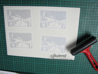
 My first step was stamping the Snowy Scene onto White Pearl card. I used Versafine Ink in Onyx Black and  Majestic Blue, stamping 2 of each. Then I laid over them a sheet of Double Sided Adhesive , from Stix2. I used an old brayer I keep for this sort of thing to make sure it was stuck down well with no air pockets.
Tip here: When you come to put down your adhesive sheet, DO NOT peel the covering layer off completely. Just peel it back an inch or so, and stick that edge to the edge of your card. Then slowly pull back the backing, smoothing it down as you go.
 Now you have your adhesive sheet down, cut the images down to size, either with a knife & ruler, or your cutting system. This way you only put Glamour Dust on your image, and not waste it on scrap you will cut off and throw.

Next,peel off the cover sheet on your image, place on a sheet of scrap paper, and sprinkle with Glamour Dust. I advise burnishing well with your fingers, to make sure the image is covered, and also that when you tip away the excess, what is left on the image will not shed.
Now I have all four images trimmed and coated with Glamour Dust,I matt them onto corresponding colour card and they get put to one side whilst I make the Christmas Words backing.


Using the same Versafine Inkpads, and two more sheets of Pearl card, I stamp up the backgrounds. No Stamp positioner needed for this step, it's easy to do by eye with a clear stamp. If  I was using a Rubber stamp, a Stamp Positioner may be a good idea, to make sure you don't leave any gaps.

Two sheets finished, and before attempting any trimming/cutting, give it a blast with your heat gun, as the Versafine takes a while to dry on the Pearlescent card, so it smudges easily. Guess how I figured that one out?


My next step was to cut the background down to size, and believing my card bases to be 7"x7", I cut 4 of each colour in 3 1/2" squares.Then I ran around the edges with the corresponding ink pad.


 As you can see, my pieces didn't fit.The corners at the centre should have just butted up to each other, not overlapped. So I had to cut a little off one corner to keep it flat.


 Good job I tried out a 'dry fit' first.


 I double checked my measuring, and yes my pieces were the right size. Checked the packaging on the card pack, and yes, 7"x7".


So I measured the actual card. Not 7"x7" at all it turns out. 6 3/4" square it seems.
Which is why my pieces wouldn't fit. I would have been really annoyed if I hadn't been covering up the centre  with the focal image.


I assume that the cards have been subjected to conversion to metric sizing, and the packaging doesn't reflect that, as when measured with a metric ruler, they are 170mm.


Anyway, back to the cards. All four have the words background stuck down with double sided tape.The focal image  is added with foam pads, to raise it slightly. I stamped the Merry Christmas greeting in the lower right corner in matching ink. This greeting by the way, is usually all on one line, but I needed it to have the Merry above the Christmas to fit, so I just snipped between the two words.I could have done it by masking off the word I didn't want with tape, but this way was quicker and easier. Final addition, just for balance, were a couple of snowflakes from the Creative Expressions Sue Wilson Snowflakes set of dies.I stuck these down with a Zig Glue pen, and lay them down with an acrylic block on top to make sure they stuck.
 So that's my first four cards completed!


Card Recipe:
 Visible Image stamps, Merry Christmas, Snowy Scene and Christmas Words
 Card base, 7x7.
3 sheets of pearlescent card.
Versafine in Black and Majestic Blue
Pieces of black & blue cardstock to matt image onto
Glamour Dust
Stix2 adhesive sheet
Sue Wilson Snowflake die set.
Double sided tape and foam pads.




Sunday, 22 February 2015

Birthday Card with Indigo Blu stamp

So, I can blog this card, now its been handed out.
 I mentioned last week we were going down to Plymouth, for a friends 30th birthday meal, so a card was a necessity. The stamp used, by Indigo Blu is one of their 'Dinkie' range, it measures 3" x 2 1/4", and features a Penny Farthing, which seemed perfect, as Rob is a keen cyclist.


The card is based on samples I saw at Pink Tulip crafts quite a while ago, when I bought the stamp.


I must admit, I did a few colour variations, both in the stamping and the inking, until I found one I really liked.The stamping was all done in Archival, apart from the grey, which is Versafine.


Out came the trusty stamp positioner, as I cannot 'eyeball' this sort of thing, I'd never have got an even spread of the stamping. Its just 3 images stamped from one inking, so they gradually fade out.


I did one pretty much the same as the samples.
Then added DI in Tumbled Glass & Salty Ocean, Scattered Straw and Old Paper.


Same inks, but this time in bands across the cardstock.


Then I tried a sort of half and half.
Then the one I finally used.This one is again DI in Tumbled Glass and Salty Ocean, then Adirondack Sandal and Lemonade, with a little DI in Squeezed Lemonade also.


The corners were punch with a SW punch- can't remember when I last used that,and matted onto dark Blue cardstock.


Dark blue brads in the corners.


For the front of the card, I used some Tim Holtz paper from the Lost and Found paper pack, which features a bicycle themed sheet, in french.

The sentiment was stamped in the same Cobalt Blue Archival, onto an offcut sponged the same as the main image, then punched and matted to match.

The numerals for 30 are a set of stamps from Dimension, who used to be Dimension Fourth. I stamped them in the same ink onto offcuts of the backing paper, and attached them with Pinflair glue gel.


I now have a number of stamped, and some inked, images left over.


When I was looking at the samples after I'd done this card, to get the image for this post, I noticed the Butterfly card in the left corner. Its been done with Adhesive film and Glamour dust. So, I thought, I wonder what one of these images would look like?
 I took the one that I'd inked in bands, and added a sheet of double sided adhesive film to it.


Before I peeled the backing off, I burnished it down well with a hard rubber roller.


Peeled off the backing paper, and sprinkled it with Glamour Dust, in Crystal. Rubbed over it first, to make sure it was well covered, then tipped the excess off.

Came out looking pretty good, I thought.
I matted it onto some pale blue card, stamped a sentiment and matted that onto pale blue too.


Now it needed a backing, and I wanted something fairly light. In the end, I embossed a sheet of thin white card with a Cuttlebug folder, called Cogs and Wheels. I added a couple of strips of adhesive blue gingham ribbon, then the image over the top, along with the sentiment.
 So, two cards out of one idea.


Saturday, 22 March 2014

A return to Triple Time Stamping

I like this really neat technique, which exploits the 'halo' effect you get when you stamp over a paper mask. For this card, which is on a 6x6 square base, the stamping pieces were 5", 4" and 3", and the blue mats 51/4", 41/4"and 31/4".

I cut all the white pieces first, then stacked them up using a repositional tape runner on the backs.


 I stamped the flower, which used to be a wood mount, by Butterfly Kisses, called Sakura,
in Brilliance Pearlescent Blue.


In order to get the effect, you need to make sure some of your images are stamped over all three layers.


I added some random small flourishes in Versafine Majestic Blue.
 The blue matting layers were cut next, and each stamped panel added to its corresponding mat.
 A useful tip here is to write a letter 'T'  lightly at the top on the back of each stamped and matting layer as you separate them. Its very easy to get disorientated when  flipping them over to add tape, and it can be awkward to get them layered right, depending on what images you have stamped with.
Before attaching to the card blank, I wrapped some ribbon around the panel. the sentiment is an old Penny Black stamp, and was stamped in Versafine Majestic Blue again, then die cut with a Nestie, Labels 4,small,  and a mat layer cut with the next size up (large set). I added it over the ribbon with some small foam pads.
 I repeated the design for two more cards, both for Mothers Day.


 This one was again stamped in Brilliance Pearlescent Blue, this time I used a brighter blue matting layer.  The second card was stamped in Brilliance Pearlescent Lavender, and a different scroll stamp used. The sentiment is die cut on the same Nestie die, just larger sizes.


Supplies:
White card for stamping
 Brilliance Pearlescent Blue and Lavender inkpads
 Versafine Majestic Blue
Matching cardstock for matting layers
Image stamp- 2 is best
Sentiment
 Ribbon
 Nestabilities Labels 4, large and small set


An End of an era

An end of an era

I write this with a broken heart, that only time can heal My beautiful, wonderful wifelet Shaz (Silverwolf) passed away peacefully in the ea...