A warm welcome to all my visitors,

Thank you for taking the time to come and look at my blog, I really do appreciate it. I would love you to leave me a comment, even if it’s just to say Hi. It means I can come visit you!

All my designs are original, so copyrighted to me. If I have been inspired by someone elses work, I have named them in the post, and where able, I have provided a link.

Please feel free to use my designs for inspiration, I just ask you to credit me, and provide a link back to my blog.

Thanks, Shaz XX

Monday 27 March 2017

Mothers Day cards,with Mixed Media dies.


Two cards made, using patterned papers, peel offs and a die set called 'Delicate Asters', from Heartfelt Creations/Spellbinders.


The set has 4 different sizes of flower, along with some centres and a leafy branch. I'll be honest, I've had this a while, but my early attempts with it were a nightmare for cutting. Getting all the flowers to cut cleanly was impossible, I had to resort each time to cutting each layer individually, which, if you want a few is incredibly time consuming. However, I recently bought a Precision Base Plate for the Big Shot, which I can use in my BSPro, and that does make a difference. As does trying to line up the dies to go through at the edge of the machine, rather than the centre.
 Word of warning, apparently over time the Plate can cause damage to the dies, so it's one to be used sparingly.
Back to the cards. I'd picked out some 7"x7" deckle edged cards that I got at Happy Stampers, and a couple of A4 sheets of white card to trim down to fit.
I'd been tossing around in my head a design for the cards, fairly simple to do, but look really lovely.
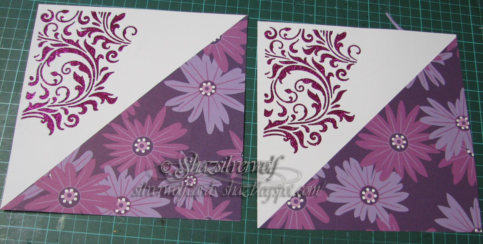
 Next came a hunt through the patterned papers- not for the faint hearted, I assure you. Finally settled on this one, which comes from a Dovecraft pad,called Amethyst Floral Prints with  designs by Kate Knight,which is quite an oldie, but is still available, certainly  on E-Bay. My pack is 8"x8", but it also comes in 12"x12".
Slight jump in the pictures here, I forgot to photograph the die cut stage! I used Tim Holtz Mixed Media die set #2, and cut this from the top left corner. I cut the paper sheet into 2 triangles, and trimmed them down to fit neatly.
 Next job was to find something to back the die cut with, and after rejecting patterned papers as being too 'busy', I decided on a Fuchsia coloured glitter paper.
 This was going to need a wet glue to attach, and my wet glue of choice is silicone glue, or Pinflair Glue Gel.
 The other point that would need to be addressed is that die cutting those MM dies does result in distinct warping of the cardstock, which meant I needed to apply glue to areas of the design, not just around the edges.
 I sorted that by using a small paintbrush to get into some of the finer detail areas.


 I worked on top of the glass mat, as it meant I could keep lifting the cardstock, and wiping off any glue that may have spread through the design.


  A little longer than a couple of strips of tape, but does a better job. Now it needing laying down with some weight on the top to make it set 
flat.


While this was drying, I moved on to the flowers.


I cut some in a pale lilac pearl paper, some in white and some in a white vellum.

 I only used three of the four flower sizes to build them up this time.


I shaped them using a ball stylus, my pokey tool and a foam mat.


Stacked up using Ranger Glossy Accents, and seed pearls/ seed beads added to the centres, also with Glossy Accents.


 A few hours later, and the silicone glue has dried, and they are nice and flat.
 Here I added some peel off strips across the edges to finish them off neatly.


Foam tape on the back to give the panel a little dimension and support.


The flowers positioned on the patterned paper - they look similar to the paper, which gave the idea to use them.


A peel off Happy Mothers Day sentiment was added just below the flowers.

Wednesday 22 March 2017

WOYWW #407

It's not a pretty sight by any standards, I agree. Detritus of  a Christmas card making session there, see the post below, for the latest challenge. Use two patterened papers was the brief. As you'll see in a minute with the next couple of photo's, not a difficult thing at all. Two? It could have been a hundred & two and I'd still be sorted.😈
 Also to be seen is the practice piece from my white inkpad review (below the Christmas card post), and one of the pieces I was doing that prompted the review. You'll see, it does all tie together when I do the card making post.


So, patterned papers then. This is an A4 RUB, and holds 6" & 8" pads, and a couple of tall thin pads, along with a selection of odds and ends.


This is a 12"x12" RUB, holding 12" square pads, 12" papers,some random sheets of paper & cardstock, and a couple of envelopes, one  with scraps and the second with spare stamped images in.


So thats how the 'getting down the patterned papers project' is coming along. Maybe in a couple of extra lifetimes, I may get close to the bottom of the boxes.

On another note, I've ordered our tickets for Happy Stampers, so thats all booked now and looking forward to that.
For anyone who has been thinking of getting the TH Tonic stamping Platform- the cheapest place I've found it, still pre-order to ship Mid April, is here, Crafts World Online. £26.49, and free shipping.
 Next bit of news, saw the surgeon last Friday. The nodule in my lung was a secondary from the bowel cancer, not a new primary. They are happy it, and plenty of surrounding tissue was removed, and are happy with me enough to discharge me from their care back to my local surgeons & Oncologist. He will organise a full body scan in the next few weeks, and it's basically just back to monitoring me now.
In other news, it seems my type two diabetes seems to be behaving well with the tablets I've been given, had two blood tests now and they are quite sure that's what it is, still puzzled as to why it just literally popped up straight after this surgery. I have to have a fasting blood test this week, then next week get an appointment with GP to get told all the do's and dont's. Although the diabetes nurse who came and saw me in hospital said it's just a case of sensible eating. Have a biscuit or two, just don't eat the whole pack. Have a couple of sweets from the tin, not the whole tin. That sort of thing. And my Mum was diagnosed as type 2 about 30 years ago, and has managed hers with tablets and sensible diet, so don't really forsee any problems. So I'll be linking up with Julia at The Stamping Ground,and coming round to have a snoop around the desks of shame a little later.

Monday 20 March 2017

Christmas Card Club, Challenge #6

Right, I'm finally back in the game with this fortnights challenge. I'd like to say a huge thank you to all the ladies in the club, both for their patience while I got better & found my mojo,😃, and for the get well cards & good wishes.
 So, onto this challenge, set by Granmargaret, which was to use two, or more, patterned papers. To be truthful, I could do with following this particular theme a lot more- I have so much patterned Christmas paper, it's embarrassing!
Well, here we are- two patterned papers, plus I also managed to use an image I must have stamped years ago. I spotted it in my ' oddments' folder😯when I opened the box I store all my paper pads in. I have to admit, I have no idea who made that stamp, and I'm not sure I still have it, but this is definitely the first time it's appeared on anything.
It had been stamped in black and heat embossed onto a pale cream paper, so I decide to use some of the Imagination Crafts Starlights paints on it. I did two, as I wasn't sure what colour papers I'd end up using.
Before and after. I did two completely different colourways, and if you haven't seen the Starlights yet, they are gorgeous jewel shades filled with gilding flake dust, which gives them a gorgeous sheen. They spread for a very long way, and mix together easily too- I mixed the green and Pearl white to make the pale green for the one tags background.


Here I'd backed them with some cardstock,  as the paper was curling a little.
 Two shots, hoping you will be able to see how lovely the paints are.


I now had a search through the paper pads, and found this one. I'm not at all sure where I got it, but it was either The Works, Happy Stampers or the NEC!
It does have some nice co-ordinating papers in traditional Christmas colours.


I chose these two, and covered the front of a 5" square card base. Across the join I placed a border peel-off. They are rarely long enough to do a diagonal on a card, but when I have a focal piece to add, I just cut it in half, and have a gap under the focal image.


I picked this tag, as the colours seemed a good fit for the patterned papers.


  You can see I have punched the hole in the tag. I used a tool I bought a while ago, but hadn't actually  tried out till now. Its a Japanese Screw Punch, and this one is by X-Cut. I have to say it's a great little tool- punching holes in stuff has never been so easy! Lovely clean cut hole too. It comes with 3 different sizes of hole punch, which just screw in, and they are stored in the handle when not in use.

Fab clean hole, in one totally effortless operation.
 You just push down the handle, and job done.


 Next a selection of thread to tie through the hole. One is red/gold, one gold, and one red/green/gold.


And that's it. I mounted the tag with foam pads, and added a peel off sentiment to finish.

Saturday 18 March 2017

White Inkpads- The never ending search!

Right, so I know I did this sort of thing a while ago, probably a couple of years now, and since then I've acquired a few new whites. As you do.
 This is by the way of a bit of a side project, as it started out that I was going to recreate the card I made with Pauline last week, then I looked into the Black Magic technique  on Pinterest, and realised that it can also be done with White Pigment Ink, so I thought I'd do a side by side comparison, to see which gave the best effect, Gesso v Pigment Ink.
 Then I needed to see which of my whites would give the best coverage on black, and here we are with a blog post!
When I did the last try out, I think the only pads I had were the Hampton Arts, Studio G and Brilliance, besides the despised Staz-On White Opaque, and I believe I also embossed them with white detail powder. These ones are not heat embossed, so the colour is as it comes from the inkpad.

So here they are, and I've made the image extra large, so you can see them clearly. I've also split them down into rows, with a few words for each.
Tims Picket Fence shows up remarkably well I thought, but the middle two, Do-Crafts Artiste Palette and Ink It Up left a very pale imprint. The Adirondack Snowcap also produced a good print- when I realised it had a plastic cover over the inkpad!😀😀
 On the next row, I thought only the Versacolor White gave a poor image. By the way, the Colourbox Frost White is a VERY juicy pad- I had to clean off the stamp and try again, so a very light hand when inking up with this one.😁
The final two, and I did squeeze these on to the bottom of the card, as I'd used an offcut, but wanted to get them all on the same base, for comparison.
 Both these inkpads produced a good image, in my opinion. I'd be happy with either one.
 Could well be a case here of getting what you pay for, as the two worst performing were also both at the bottom end of the price range on inkpads, just a couple of pounds each.
My top three would be Memento Luxe, Brilliance Moonlight White and Colorbox Frost White,followed by Picket Fence,Hampton Arts & Studio G. Snowcap from Adirondack would be next, along with Versacolor, and finally Artists Palette and Ink It Up.

 By the way, a tip I picked up from a forum: When using a White inkpad for something like the Bokeh technique, where you are adding white ink to a still damp inked background- smoosh your white inkpad onto your craft mat, or put a little reinker on your mat, if you have it. Then work from that, thus saving your precious white inkpad from getting stained.

Wednesday 15 March 2017

WOYWW #406

So here we are, rushing through March already. Linking up as always on Wednesdays with Julia over at The Stamping Ground.
 On my desk this week are three partly finished cards from Pauline Butchers Workshop I did on Sunday.
 Learnt some new ways of doing things, the Floral stencil on black is done by sponging on Gesso first, then adding colour over that. I think a sort of version of the Black Magic technique. Some of the Gesso got under the stencil, but that can be repaired with a black pen, and I quite liked this technique, so may give that another go.
 The seahorses card I'm not happy with at all and may take them back off and try something else. Maybe butterflies and flowers, or dragonflies. Not sure yet.
The background is done using Liquitex Heavy Body Gel through a stencil, then when it's dry, using Brusho's for colour over the top.
Did have a lovely time at the workshop, which Erika also went to, and met some lovely ladies. I may well do one or two more, we shall see.
This quilt picture gave me quite a shock when my daughter, Louisa, put it on Facebook and asked me if I remembered it. I had completely forgotten about it, but when I saw it remember making it for my youngest sons cot, and he was 30 this year, so tells you how old it is. I also remember making a sleeping bag the same way, and apparently she still has that too.
  So there we are, short and sweet this week. By the way, I have an appointment with my surgeon for a follow up on Friday, so we shall have more information after that. I'll let you know what was said next week.

Wednesday 8 March 2017

WOYWW #405

There is finally some crafting activity on my desk. I'd die cut all these pieces, using various Tim Holtz Mixed Media dies,back before I went into hospital, so I'd have something to help me get going again when I came out.
 It's almost 4 weeks now since I came out,and I'm finally starting to feel like doing something again.
Due in part to the fact that, as I said to Doug on Sunday, I felt like I'd finally turned a corner in so far as the pain was starting to recede. I'd been on slow release morphine for a week when I came out of hospital, then when that was finished my Doc gave me some Co-Codamol, but after a few days it was clear they weren't helping, so I went back and he gave me Tramadol, which I've been on for about 10 days, but they have helped.It's just been a constant nagging pain, and the only way I can describe it is if you've had on an underwired bra that's a little too tight- and as the day goes on it feels tighter and starts to really hurt across your ribs just below the breasts? That feeling. Constantly. The only help is lying down to take the pressure off, but then the Tramadol sends you to sleep? Anyway, Sunday  I had some Tramadol first thing, but the swapped back to Co-Codamol for the rest of the day, as I knew the pain had taken a definite backwards step, and I felt much better. And I've been improving ever since.And it's only when you start to get out the other side of this, that you realise how depressed you were becoming.
But, this Sunday I'm going to an Inky Workshop with Pauline Butcher ( DT for Lavinia Stamps, Visible Image and others) as I thought this may well help to give me a kickstart.
 My personal review of the Distress Oxides is below, and I will do another, getting a bit more use from them soon.
This is the first card from my die cut stash, I thought they lend themselves to something like a Sympathy card quite well.
I've just started a second one, but I needed to use a wet glue- which I hate doing, by the way- so it's been put to one side with some weight on top to dry.
So that's me done, I'll be visiting later, and getting round to packing the stuff I need for the workshop- last minute as always!

Thursday 2 March 2017

Distress Inkpads- Regular v the Oxides.

As I promised some results of me playing with the Oxides, and seeing how they differ from the regular ones, here it is. I'll start with a shot of the ones I'm going to compare- Fired Brick,Fossilized Amber, Wilted Violet Worn Lipstick and Spiced Marmalade.


The first colour is Fired Brick, and you can clearly see the difference in the two pads. The actual material the pad is made from is the same, but the colour is totally different.


Here they are sponged onto my journal- Oxides on the right, Original Distress on the left.


 On paper you can see the Oxides are slightly Opaque, while the Distress Pads are more transparent/translucent.
They also have a chalky looking finish, compared to the regulars.


 A view of a couple more pads so you can see how much they differ.


Swatches of the remaining three inkpads.


Now for something quite interesting.
 Apparently,the new inks will show up on black or dark cardstock, so,  to make the test as difficult as possible, I've picked Worn Lipstick and Fossilized Amber, as those are probably the lightest colours.


Just for fun, I sponged some regular Distress ink onto the black card. Apart from a patch that looks a bit wet, that's all you can see.


 But the Distress Oxide is another matter entirely. You can see the pale pink of Worn Lipstick against the black card clearly.


 The same with Fossilised Amber-The Distress Oxide shows clearly on the black card.


So that's it's first big difference to Original Distress inkpads.


Next up- sponging & blending onto white cardstock.
I'm going to use Fired Brick and Peeled Paint to do this with, and I know you are all thinking I'm crazy- thank you, I do appreciate compliments,lol- but bear with me  moment.


So as we all know, try to blend together red and green, and you'll get mud. Which is exactly what we have here, where I've sponged on the Original Distress inkpads.

Here you have the new Oxides sponged together- the same two colours, Peeled Paint and Fired Brick. But with these because they are slightly opaque, the red seems to sit on top of the green, so no mud.


                                                    Here they are, side by side. 
                                                   
This does of course mean they are not going to blend in the same way as the Original Distress pads at all.


I did the same with these two- Wilted Violet & Fossilised Amber, the Oxides being the ones on the right. You can see the purple showing  through the yellow without mixing. I also spritzed it then with some water, and they still react as normal Distress does.


So thats as far as I've got at the moment. I will be playing and posting the results for them too if I get chance over the weekend. I'm curious to see just how much they can be used for, especially as they don't blend together in the same way. I'm also curious how well they will work with regular Distress inkpads, and what can be achieved there. Can they be blended together? I wonder.

An End of an era

An end of an era

I write this with a broken heart, that only time can heal My beautiful, wonderful wifelet Shaz (Silverwolf) passed away peacefully in the ea...