A warm welcome to all my visitors,

Thank you for taking the time to come and look at my blog, I really do appreciate it. I would love you to leave me a comment, even if it’s just to say Hi. It means I can come visit you!

All my designs are original, so copyrighted to me. If I have been inspired by someone elses work, I have named them in the post, and where able, I have provided a link.

Please feel free to use my designs for inspiration, I just ask you to credit me, and provide a link back to my blog.

Thanks, Shaz XX

Showing posts with label Inkpad comparison. Show all posts

Friday, 13 February 2015

Red Inks

Well, this is a novelty- two posts in the same week! I showed a new inkpad on my blog, the Ranger line that will be replacing the Adirondacks. I bought the Red Cherry, to see how it compared to the Red Pepper Adirondack, although I have managed to get re-inkers for pretty much all of them now, and as I've had them a few years yet without re-inking, I'm probably not going to run out in this lifetime.
So this is the old and the new, and there are re-inkers for the new ones too, and Susan over at Countryview Crafts has both on her site, she's also the wonderful stockist who has managed to order all the Adirondack re-inkers for me, so if you want the most fantastic customer service, as well as free postage, you know where to go! Anyway, back to the subject. I was curious to see how Red this one was going to be, and a few of you commented on the post you'd be interested to see what I thought of it.The packaging looks like a nice strong red, but then again so does the Red Pepper. But as that's not always a good guide to reality, I ink up my own narrow labels to put on the ends.


I sorted out some red inkpads, and a handful of cosmetic sponges, so I could use a fresh one for each colour, not getting any colour contamination.


I went and found a few other reds after, a  Brilliance pearlescent, as well as a couple of others I have in Dewdrop size.


So here is what they all look like, sponged out.


Now how these look will differ from monitor to monitor, I know, but I think the basic shades/tones should show up ok. The three Adirondacks at the start are the ones I see as being in the red range, although the Watermelon probably veers more towards Carmine. Next up is the new Classic Cherry, and I was surprised that it is much redder than the Red Pepper, which almost looks orangey by comparison.The Versafine Crimson Red looks more like Distress Aged Mahogany than anything else, and that (The DI), also looks like it need inking! Festive Berries seems to me to be the truer red of the Distress inks, Barn Door and Fired Brick have definite orange tones to them. The Docrafts Palette inkpad, which is a pearlescent ink, to me looks more of a Carmine, than red. The Brilliance Pearlescent Poppy is quite dark, I'd have expected a Poppy colour to be brighter. The two Marvy inkpads next up both seem like good reds, the trouble is that Marvy have discontinued the Inkpads, and I can't find anyone in the UK with re-inkers either! Which is a shame,as I'd like to get some for those two shades. Memento's Rhubarb Stalk looks very similar to the Pearlescent Poppy/Versafine Crimson Red. The Ink It Up pad on the left end, I've had for ages, I don't even know if they are still about. That's a pigment inkpad, and not a bad red, to be fair. The bottom two Dew Drop pads I bought recently. The Versamagic is a chalk ink, and I think veers off towards orange again. The Memento Lady Bug is a nice strong red, and to be honest is probably my favourite for a good clear red. So I may well be upgrading that colour to a full sized pad- easier for brayering from.
 Right, onto actual use:
I just tested the Classic Cherry for print quality against a couple of the other dye inks, and the print is perfectly good. The smudges were ink off the side of my fingers!
Its funny, I'd always thought the Red Pepper was a good red, but up against the new one, and the Memento Ladybug, not so much. All this testing was just done on a bog-standard piece of white cardstock, nothing fancy, so results might vary a little when its used on say, Neenah cardstock, or glossy coated. And if anyone ever asks why we need so many inkpads, you can quote this test of 17 red pads, and no two are exactly the same! Similar, but not identical.Actually, that's quite scary. I had no idea I had that many reds. And  I do know that I have a bigger selection of blue pads and green. I'm not even going to count those!
 So, the biggest surprise for me was the Red Pepper inkpad- clearly not as Red as I'd always thought. One thing I want to mention, I was sat down doing this, so when I picked the inkpad up to take the lid off, I did notice a very slight solventy smell to the new Ranger one. Nowhere near as strong as Staz-on, which always reminds me of almond marzipan, and if you take the lid off while the pads down on the desk, I didn't notice it at all. But it definitely smells different to most dye pads. On a side note, does anyone else find this same problem with Red lipsticks? They nearly always veer towards orange, or start to turn orangey when you've had them on for a while?

Sunday, 7 October 2012

Clearly Better- A new type of ink for Clear Stamps

IMG_6774 w   I'd seen a few mentions of this inkpad, and had news of it in a Chocolate Baroque newsletter. As clear stamps can be most awkward to get a good print from (even assuming a good stamp quality), I thought this worth a try. Generally people seem to advise using a chalk ink to get a good imprint, but equally, Tracy from Lavinia stamps swears by, and always uses, Versafine.

  I have a selection of Black dye inks, and to be honest, my go-to for clear stamps is usually Versafine Onyx Black.

IMG_6771w

So these are the Black dye inkpads I have, and they are what I have used to compare the Clearly Better inkpad to.

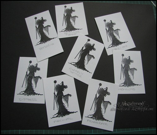
I  used two Lavinia Stamps , Secret Garden, for a 'line' stamp, and Willow the Witch, for a 'solid' stamp. It does seem that solid silhouette type images present the greatest challenge  to getting a good, clear print, and there is little more annoying than ruining a piece with a print that has light patcheIMG_6779 ws, or bits missing.


And I wanted to see if the inks gave a good print on both styles of stamp- I don't want to have to use two types of inkpad when stamping  something.

I stamped onto Neenah card for all the images, so it is possible that the results may be different on other cardstock. I also went over both stamps with an eraser first, and then with some low-tack tape, just to give them a good clean.                      

  Before I stamped with them, I re-inked both my Staz-on and Archival pads, but all the others were plenty well inked already.  

IMG_6780 w

So this is the first two prints with the Clearly Better pad.  Both images came out well, and definitely I got a good solid image.    All the following pictures show the same two Clearly Better images with a comparison to another ink pad.

IMG_6781 w


     Here the comparison is Archival Jet Black. Not perfect on the solid image, a little blotchy in one or two places, but the line image was fine.

IMG_6782 w


Next up is Adirondack Pitch Black, and again the solid image isn't as solid as I would want.

IMG_6783 w

  Here it is up against Distress Ink Black Soot, and you can tell even when inking the stamp that the ink is too wet to get a good solid print, but if you want a nice worn image, it would work well. But the line image is a good one.

  IMG_6784 w


Now we come to Versafine Onyx Black, and this is by far the best image so far. The solid print is solid, IMG_6785 wand the line stamp came out well too.


Clearly Better and Memento Tuxedo Black next.The Memento definitely came off worst here in the solid image comparison.

IMG_6786 w


Final print is Staz-on, and I was really not impressed. You recall I had re-inked the pad before I started, so I did expect a better image, to be honest.IMG_6787 w


One final try-out, I spotted a Brilliance Graphite Black Pigment Dew Drop pad on the shelf- but again, a slightly blotchy print on the solid stamp.


IMG_6788 w IMG_6789 w  So here are the final prints of the solid stamp, on a black and white background for contrast.

And the line stamps, also against white, then black.

IMG_6793 wIMG_6792 w

Overall, the line image came out fine with all the inkpads.I'd be happy with any of them on my projects. But, the Versafine and Clearly Better inkpads gave the best print with the solid image, followed closely by the Archival. It was hard to see the blotches on the Archival, and maybe it was just how I inked the stamp? So if you already use Versafine, I don't see any real improvement in changing to the Clearly Better.

But if you do want a good pad for clear images, then I hope this little trial helps.

Which brings me to one thing that really annoys me, to be honest. The difficulty in getting re-inkers in the UK. Distress re-inkers are available everywhere, easily. But the rest? I know Versafine pads last for ages (I've had mine years), but, when I do find it getting pale, I cannot get a re-inker for it over here. In the USA, they are readily available, I know only for the Black & Sepia, but that would do. Hardly anywhere in the UK has a good range of re-inkers, and obviously that means they sell more inkpads,but on an ecological level, I dislike having to throw something away that I should not have to. And ordering a few re-inkers from the US is hardly ecologically friendly, is it? So if anyone knows a craft store, or stores, that actually do have a good range of re-inkers, I'd love to hear about them.

NOTE:     27 Oct 2012, had an e-mail newsletter today from Chocolate Baroque, the Clearly Better inkpads are being discontinued! I will leave the post up as it is though, as at least it gives a comparison between the other pads.


SECOND EDIT: 
I was re-reading this today, as I wanted to post a link to a discussion on black inkpads on SCS. I wanted to add for British readers, if you want an online store with a very good range of re-inkers, can I recommend Countryview Crafts?
 Susan, the owner, is a very helpful lady with any products she doesn't actually stock, so if you can't find something you want, drop her an email. I wanted to get reinkers for all my Adirondacks, which are being retired, and after I'd bought all the ones on her site, I enquired about a few she didn't have. I got a lovely email back, and she ordered in the ones I needed. Brilliant customer service, and her site is free UK shipping too.

An End of an era

An end of an era

I write this with a broken heart, that only time can heal My beautiful, wonderful wifelet Shaz (Silverwolf) passed away peacefully in the ea...