

The teasel cards have been worked with Brusho's, which was not Plan A.

I went off in a slightly different direction than I originally intended, sparked mainly by some inkpads I hadn't used in ages catching my eye.

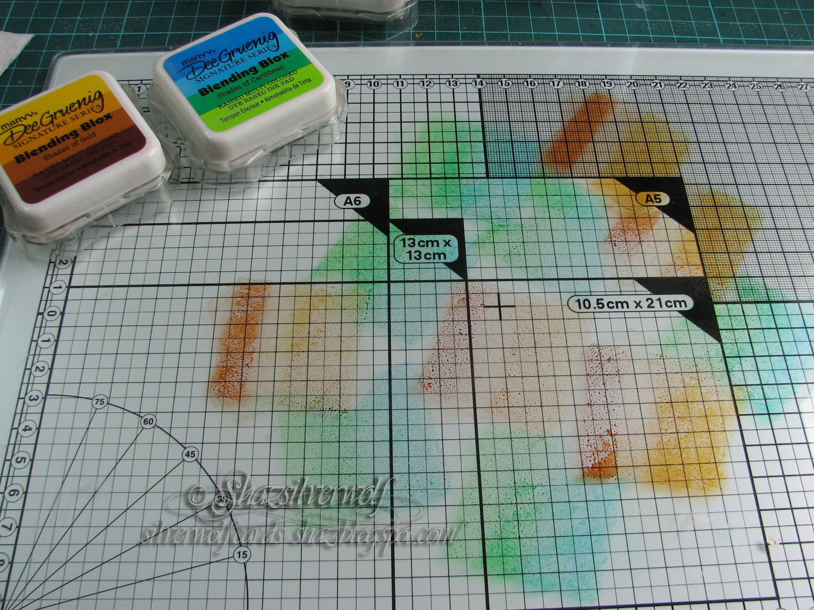
They are a square inkpad with 4 shades on separate pads.

Not sure how well that shows up, but when you originally got them, they had plastic strips separating the pads, which you can replace after use, but I never bothered.
Anyway, cut to the chase. I remembered that when I bought them, they were being demoed very much like Distress Inkpads- on a craft mat & misted with water. So, fingers crossed they hadn't dried out- don't ask how many years ago I bought them, - I thought I'd try them out.

Tried out one called Shades of Sunset first, and pressed them onto my glass mat.
Quick mist with some water, and tried this first one on some scrap cardstock. I didn't want to waste the stamped images if they didn't work.

And to be fair, not a bad result. So that will go in my UFO box for another day!

This one used the Shades of Olive pad, and came out rather well.
Looks like this may go better than I hoped.😀

Swapped to Shades of Gold for the next one. Same every time, pressed onto the mat, then misted lightly.

Came out well, and dried out nicely. Two for two, so far.

This time I thought I'd try two pads together, so used Shades of Sunset again, and added Shades of Periwinkle.

I like this one, and the ink almost seemed to have a pearlescent sheen to it, but they are just plain dye based inks.

This time I used Shades of Gold, and added Shades of Caribbean.

Not too bad, but not my favourite, either.I think I should have used different colours as the image was heat embossed with a Dark green/black Embossing Powder called Midnight Emerald.
Never mind, onwards.

Shades of Sunset and Shades of Mauve combined for this one.

That worked well, especially as the Dragonfly was heat embossed in a dark blue EP.
Shades of Caribbean and Shades of Gold for this one.

 And again, not too sure about this one. Don't know why, as I love green, but this one doesn't really grab me.
Now I thought I'd try something else, and sprinkled some Brusho's onto the craft mat, then spritzed. I used Emerald Green and Violet, and I think that was maybe a mistaken choice. The finished piece is quite dark.

Mind you, looking at it now, it's growing on me!

This one was done the more traditional way of sprinkling on the powders, then spritzing. I used Lemon, Yellow and Orange.
The white embossing does get covered with the colour, but a wipe over with a damp baby wipe, then polish off with some kitchen roll, and it cleans up nicely.

I'd done all the Dragonflies now, so swapped to the Teasels.
This one had Ultramarine sprinkled on, spritzed, dried, then a little more powder and spritz.
You can see the colour on the baby wipe from cleaning the image!

Yellow and Orange here then spritzed, and then added a few sprinklings of black,spritzed a bit more, then dried.

Last one now, Violet and Purple, with some small sprinklings of Grey.
This is still wet, and you can see how the colour sits on the heat embossed white image.

And here, dried, then cleaned up with a baby wipe over the image, then some paper towel to polish it up.


8 comments:
Hi Shaz,
great results you have I'm drawn to the yellow /oranges although a big blue fan. Great stamp set and ink pads thanks for sharing your great creations . crafty hugs Andrea x
My goodness Shaz you've been really busy playing with your colours. I've never seen these inks but you've got some good results with them, all your cards are beautiful, I love the the images you've used, I too am drawn to the yellows and golds, Kate x
Such lovely pieces Shaz. It looks like you have a super playtime with all those colours.
Toni xx
Oh wow!!! some great ideas. I do remember those ink pads. I wish they were still available as I would have them in all colors.
Oooh fabulous, both techniques were stunning. Just realised I might bump into you at Happy Stampers next week ! Cara x
Such a nice variety of colors. Love how you've shared the process, Looks like the glass works well for this inking. Again, I love these 2 stamps.
Hi Shaz, I'd say this was time well spent. The effects you've got on the backgrounds are all lovely though I particularly like the Brusho ones. I didn't have those particular ink pads but I do have some Big n' Juicy one tucked away in a drawer. It's too sad that I'd forgotten to use them but you've reminded me now so I think I'll dig them out and give them another trial. Ditto my set of Brushos. Thanks for sharing. Elizabeth xx
Gorgeous effects. Happy crafting, Angela xXx
Post a Comment