A warm welcome to all my visitors,

Thank you for taking the time to come and look at my blog, I really do appreciate it. I would love you to leave me a comment, even if it’s just to say Hi. It means I can come visit you!

All my designs are original, so copyrighted to me. If I have been inspired by someone elses work, I have named them in the post, and where able, I have provided a link.

Please feel free to use my designs for inspiration, I just ask you to credit me, and provide a link back to my blog.

Thanks, Shaz XX

Monday 29 February 2016

More Masterboards, and some Brusho ones too.


 As I said in the last post, I decided to try some masterboards using Distress Stains. I admit that generally I've bought the more vibrant, zingy colours, so I'm never going to get subtle backgrounds till I invest some more money in Tims offerings.


 Anyhow, the first one was streaked with Wild Honey, Squeezed Lemonade and Carved Pumpkin.

Then, flicking through my stencils folder I spotted this one, by Paper Artsy, which I was enabled into by Helen (Stamping By H) back last year. It looked the sort of thing that would be really useful at the time. I overstencilled by sponging on in Carved Pumpkin, then in Ripe Persimmon.


Setting that aside to dry, I started with Salty Ocean on the next one, followed by some Dusty Concord. I'd got into the stencilling now, so used two Tim Holtz stencils on this one, Mesh and Shattered, which I think looks just like cobwebs.


I used Seedless Preserves for the stencilling this time round.
Now I switched back to the DI pads, so I could get some lighter backgrounds, and the first one up I failed to photograph until I'd got to the stencilling bit, but it's shades of purple-Shaded Lilac, Dusty Concord and Wilted Violet. First stencil was Tim Holtz Honeycomb,inked in Wilted Violet.The flourishes stencil is called Mini Capricious, and the clocks stencil Mini Time Travel, both by The Crafters Workshop, both inked in Blueprint Sketch.
 The next stencil I'm using I hope you can see in the picture, is one of a variety of sized circles, which I cut on my Silhouette machine, from OHP film. This also got inked with Wilted Violet.


 For the next piece I went back to the leaves stencil,onto a background done with Squeezed Lemonade,Mustard Seed, Shabby Shutters and Twisted Citron.The leaves were stencilled first in Shabby Shutters, then in Wild Honey, and finally with a baby wipe through the stencil to remove some ink and give a ghosting effect.


Final sheet of Distress Backgrounds, and I used quite a lot of colours on this one. I went through all the pinks, just building up colour.


Then I brought in Picked Raspberry, Wilted Violet and Carved Pumpkin.


I started stencilling with Wilted Violet again, and the stencil is a Clarity stencil, a circle of stars and dots.I just used parts of the circle, and moved the stencil around to give me a scattering of stars. The branches, in Picked Raspberry, are from a stencil by Imagination Crafts, I think called Bird Houses.


Now the first ones had dried, I started adding some stamping. Using Candied Apples and Blueprint Sketch DI's, I stamped 3 different dragonflies over the orange background.


The green and yellow sheet had 3 different butterflies stamped in Lucky Clover and Cracked Pistachio.


As I'd stencilled what looked like cobwebs on this one, I continued the theme with a skull stamp ( Stamp Addicts Sheet, Skulltastic), a dancing skeleton,( Lost Coast Stamps), and a flight of birds from a Cherry Pie Artstamps sheet,Dark Boundaries. The skull was stamped in Blueprint Sketch DI, the rest in Seedless Preserves.


On this one I stamped a dandelion head from an Inkylicious set, called Make a Wish.The flock of birds stamp is also Inkylicious, a Twinchie stamp, both stamped in Seedless Preserves.


The stamping on this one was again Inkylicious stamps, a clocks set called Timepieces. I used Chipped Sapphire DI to stamp in.


So thats the DI pieces. Whilst I was making a mess, I thought I'd have another play with some Brusho's.


I was interested at first to see what other colours you get, when using a single colour group. This sheet only has blues on it, but you can clearly see some purples forming from the powder.


So I did the same with greens, and here there are yellows, oranges, reds and even some faint blues, just from green powders. The olive green did seem to burst into the widest range of colours.


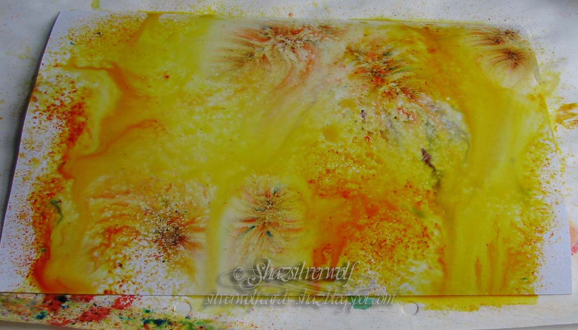
 Ditto with yellows, we have oranges and browns too.


In fact, reds seemed the only colours to stay true.


Then I started getting random- I love the almost organic shapes you get forming. This was water misted onto the paper first, then the powder sprinkled on.


This was powder first, then spritz.


 This one was lightly sprinkled with powder, then lightly misted.Less water gives you a more confined spread.


This one started out by being pressed onto the one directly above to mop up some of the water, than I added a few more powders.

Masterboards

As I can't yet show the cards I was making up the other day, being Mothers Day cards, I decided I'd have a play at some masterboards, with the intention of making some more mosaic cards. Distress Inkpads were used, mainly Ripe Persimmon, Picked Raspberry, Worn Lipstick, Squeezed Lemonade, Mustard Seed, Wild Honey, Spiced Marmalade,Broken China, Mermaid Lagoon, Salty Ocean,Mowed Lawn, Twisted Citron and Cracked Pistachio.


      The overstamping was done with an array of assorted stamps, some images, some texts, using the same colours as I'd sponged the backgrounds with.  

I love the visual impact of mixing reds/pinks and oranges!

This is the one I'm least happy with, the sponging didn't come out as I'd intended, but I'm going to be cutting them up/punching out squares, so it won't matter. 
I was sponging using those egg shaped latex sponges, and the jury is still out on whether I like them or not.I was also working off a mylar sheet, and thats another thing I'm not sure about. I get the whole' uses less ink' thing of a mylar sheet, and being able to come back to it and use the remaining ink on the sheet a few days later, but I don't ever do that. Nor can I see me ever doing it. I'm usually doing a few backgrounds at once, so keep cleaning it off as I go. I also find it's harder to get pale blends, as I end up with too much ink on the sheet from dabbing off. I do think the Inkylicious brushes allow more control for a soft, paler blend, and I personally prefer working off scrap paper to get my sponging/blending done. Anyhow, thats my first few, I'm off to do a few more today, as I want some other colour blends, and I'm going to see how I get on using DI stains.


Wednesday 24 February 2016

Lavinia Toadstools and SU Woodgrain.

So, this is the completed card that was knocking about on Wednesdays desk.
 To be honest, this wasn't exactly what I'd planned when I started. It sort of grew as I went along. I was going to say it mushroomed, but that would have been a terrible pun.


  It started out with the Stampin Up Woodgrain stamp, onto a sheet of white pearl card, using DI Gathered Twigs, and adding some extra markings along the plank lines & around the knots using the Ground Espresso marker.


 Next up some grasses along the bottom, and I used some stamps from an Inkylicious set called Essential Grasses, and a few shades of green from Adirondack.


Then I made a light mark across the top of the planks, about a half inch down, and cut the triangle peaked boards.


 I used a Vintage Photo Distress marker to colour all the edges, including the peaks. Tip here, if you are doing this sort of edging with a marker pen, work with the marker at the back. That way, if the marker slips- and I can pretty much guarantee it always does for me- the resulting line will be on the back of your piece, not the front.


Next I added some Lavinia Stamps Toadstools at the bottom, and also stamped out some Lavinia Spotty Toadstools to colour,both in Versafine Onyx Black. This is where it went off plan, as I hadn't intended to add cut out toadstools until now, but I'd sort of got the 'Fairies at the bottom of the garden' idea in my head.


First off I used a couple of H2O's, a purple and a blue, intending to do the toadstools in two colours and blend them in the middle.
Not too bad, but the blend didn't go as well as I'd hoped. I think it was the wrong type of card for the idea, to be fair. It sort of started to pill a bit. So I swapped to Distress Markers, and did a couple of different blends- a pink/red, and I've also tried a yellow/orange  which worked quite well.
The Spotty Toadstools is a pair of stamps, one large, one small. As much as possible I tried to leave the spots blank, but I think next time- and I've just realised this while typing- it would be easier to dot the spots with masking fluid first. My plan anyway was to cover the spots with Liquid Pearls in White Opal.


It does give a nice sheen to the spots, and afterwards I decided to add a little Diamond Stickles on top for a bit of shimmer.


With the toadstools stuck in place, I stamped the two small fairies, again Lavinia Stamps. You can't see it in the picture, but I also added some tiny dots of Diamond Stickles as fairy dust falling from their hands.
The whole panel was matted onto black, then red card, then mounted onto a  Black card blank.
Final touch was to stamp the Lavinia Stamps word stamp, 'Those who don't believe in magic will never find it', onto a scrap of white pearl card, then matt the same as for the main image.

WOYWW #351

A bit of a mess, to be honest with you. I had a few projects on the go at the same time, is my excuse.Partly the fault of getting stuff out of my UFO box. Plus I been trying to finish the Christmas Cards in the post below.I came across the Indigo Blu Blazing Poppies that I stamped out, possibly around this time last year.One set was coloured blue, which you can see on the right hand side. The other set only had a couple of flowers coloured, in shades of red. As you can see from the blue ones, I've also added some shading with Distress Inks.I'll do the same with the red ones, probably using brown shades.
 There are also some Toadstools, (Lavinia stamps), coloured with H2O's (blue & purple), and Distress Markers (red & yellow). A partly finished card at the back, the woodgrain  ( Stampin Up) with the toadstools.An assortment of inkpads, some Tombow Multi glue,acrylic blocks, (used for weighting down the toadstools), the blue parts of the card drying, after having Black Diamond Stickles added to the centres. The masks for the Poppies- I usually stamp on the top sheet, then peel off half a dozen sheets before cutting out, that way I always have spares. So that's mine, now lets all see yours. I'm off to join up with everyone at Julias, The Stamping Ground.


Monday 22 February 2016

Another Day, another Christmas card.

Well, as you can see, I went for an easel style with these. They use a Sweet Poppy Stencil, called Snowflake Bauble, with Stencil Paste and glitter.


After the stencil paste was added, I sprinkled each of the three baubles with a different colour glitter. It's reasonably easy to do, just make sure you tip the excess in each colour away from the other designs.


When I'd completed them all, they were put aside to dry overnight.


I decided they needed a bit more sparkle, so added toning  acrylic gems to each bauble.


This Crafts Too embossing folder,- which appears to be discontinued, as I just tried a search, but it's 'currently unavailable' everywhere- has a variety of Christmas Greetings, some Embossed, some debossed. You could use it whole, or as I have here, and cut the greetings into strips.


They've been matted onto black, and a very thin border left, then mounted with foam pads to make the 'stopper' for the easel card.

The base paper I used is from the reduced packs I bought in Hobbycraft recently. See post here.


One last card made with the Baubles stencil.

Wednesday 17 February 2016

WOYWW #350

Good Morning folks, and here we are with yet another Wednesday prowl around the worlds desktops.Click on the WOYWW badge in my sidebar to be whisked off to our leaders home, The Stamping Ground. Nothing particularly exciting here, just a sheet of Ryns texture/background stamps being coated with glue. I've swapped my glue this time round, I'm trying out the Tombow Multi. Previously I've used Aileenes Tack it Over & Over, but I'm having mixed results, to be honest. I've so far tried 3 different dilutions, 50:50, 60:40 and finally 70:30. At 50:50 I've had some stamps that stayed quite happily on their carrier sheets, others just kept dropping off. So tried 60:40, and it's better, but still not totally reliable. The 70:30 is too strong, they are hard to peel of the carrier sheet, and leave a residue. So I'm giving the Tombow a try. So far, seems good. I will let you know how this pans out.
 The Ryn sheet, you may notice, has another of the raindrops backgrounds on it. It is similar to the others, but on this one the raindrops are going in the opposite direction, so it's not exactly the same. Cards I've been working on are in the two posts below this, a Valentines for Beloved Hubby, and a Birthday card for Youngest Son, whose birthday is also Valentines Day. So thats me for today, I hope everyone is having some decent weather wherever you are, and I'll be round to visit shortly.
 We will be having a holiday at the end of April. Hubby has been keen to organise one for us, as he thinks we deserve a break, and I can't say I disagree. Anyway, he thought a cruise would be ideal, so I get plenty of lazing around time, and we have a 7 day one booked, which sails from Tenerife, visiting Portugal, then Gibraltar, then two ports in Spain, before we fly home from Majorca. It also includes two days at sea. We fly out to Tenerife on the 26th April, and fly home on the 3rd of May.

Monday 15 February 2016

Bird Crazy Birthday

Another take on the Bird Crazy birthday card I made a while back.

 I used the same method of die cutting the birthday sentiment from a sheet of card, then for the colour behind it, I used one of the backgrounds I uncovered the other day.
I also cut some additional letters to form 'Happy' from white card


The balloons are stamped on an offcut of the coloured card, cut out and coated with Glossy Accents.
I trim down a strip for going behind the sentiment, and add it with dst. Then the whole thing was matted onto  purple card.
 Next, I stamped out one of the Crazy Birds,cut him out using the matching dies, and coloured him with daubers and DI's.


His beak and eyes are coated first with masking fluid- available from any art shop- so his eyes will remain white, and I can colour his beak orange.


As I had to wait for the Glossy Accents to dry, I put the bird aside as well, and finished the card the next day.


I rubbed off the dried masking fluid with my fingers, leaving him nice clear, white eyes. His beak was coloured with  Mustard Seed and Wild Honey Distress markers.
 I matted the card panel onto a card blank, as a top fold card.
The HAPPY was added above the BIRTHDAY cut out using a Blutack Glue Stick. Hubby bought me these an age ago, and I've not actually tried them. I liked them- they go on blue, but dry clear. They are a good 'mid point' between tape and wet glue. When dry they hold really well, but whilst wet give you plenty of manoeuvre time. I used the same glue to add the bird,then some Pinflair glue gel to raise the balloons alittle. A fine black pen added the balloon strings.
 For absolute certainty, I put the card aside with a couple of acrylic blocks on top of the letters and the bird, to make sure they stayed flat.

An End of an era

An end of an era

I write this with a broken heart, that only time can heal My beautiful, wonderful wifelet Shaz (Silverwolf) passed away peacefully in the ea...