A warm welcome to all my visitors,

Thank you for taking the time to come and look at my blog, I really do appreciate it. I would love you to leave me a comment, even if it’s just to say Hi. It means I can come visit you!

All my designs are original, so copyrighted to me. If I have been inspired by someone elses work, I have named them in the post, and where able, I have provided a link.

Please feel free to use my designs for inspiration, I just ask you to credit me, and provide a link back to my blog.

Thanks, Shaz XX

Saturday 30 April 2011

Crafty Individuals Butterfly Square

This card features all Crafty Individuals stamps and paper. The background sheet comes from one of their pads of 6x6 background papers, Book 4, Trees. This was overstamped, using Adirondack Denim ink, with CI 021, which is a mixed words stamp. I can't find this exact stamp on their site now, so possibly it is retired, although there is a very similar one, CI 012. The base card is dark blue, scored & folded, then cut down to 15cm square.
 I cut down the sheet to fit the front of the card, and matted it onto black card. A length of Navy Blue ribbon was wrapped around this panel, then knotted , placing the knot towards the bottom. I mounted this centrally
 on the card front.
The Butterfly Square, CI 135, was stamped in Memento Tuxedo Black, then heat embossed. The image was coloured using Promarkers, then cut out & matted onto Dark Brown cardstock.I mounted this at an angle in the lower right of the panel.
 A Blue butterfly was made from the same stamp using fusible fibres, and I attached this with silicone glue, which also secures the wire anthers.
He is actually a little difficult to see in the main picture, he looks like a patch of blue background colour!, so here he is on his own,lol. Oddly, the butterfly looks bluer in this picture than it does on the card- I was not exactly pleased with how it came out. I have 3 or 4 shades of blue fusible fibres, but they all seem to develop a green tinge when the fibres are heated.

Friday 29 April 2011

Wedding Stationery


This is not a new project,but the stationery I made for our Wedding in 2009. I came across the images on my pc, so thought I would post them. The base card is Pearl White, from PDA Card & Paper, A5 size. It was creased at 1 1/2" from the right hand side, and 3" from the left.

  We wanted a monogram of our initials on the front, (Doug & Shaz),so I had two options. The first was to have a rubber stamp made, then stamp & emboss-I decided against this, as I had visions of smudged images causing a lot of stress! I had some paper I bought a while ago which allows heat embossing onto computer printed text, so this seemed the best choice. The font I used is called 'Vivienne', and I used Photoshop to place one letter over the other. The longest part of this was lining the monograms up on an A4 sheet to enable me to cut them out with the minimum of  trimming after. The monograms are 1 1/2" square, so I got 35 per A4 sheet.
We had chosen Black & Burgundy as our wedding colours, and you can see some pictures on the Personal page.
My next step was to cut up all the monograms, then enough burgundy squares (1 5/8"), then black squares,(1 7/8"). I found 'batch-making' each step was definitely easier & faster than making 1 card at a time. The monogram was attached to the burgundy square, then this to the black square. Fortunately, a couple of years ago, I came across the A4 Xyron Creative Station, in Tesco, reduced to half price to clear, and had bought one. It was perfect for this, as I could feed the monograms and burgundy squares through and have glue on the backs all in one go. The monogram was to overlap the two front panels, so I used a glue roller to add glue to the black square just on the left side.These were added  more or less centrally on the front.
I bought the Black & Burgundy organza ribbons from e-bay-I knew I needed a lot, at least 18" per card, and local prices were ridiculous! And I still have loads left for cardmaking, lol.
 I wrapped the first card with ribbon, and made the bow. Then I unwrapped it, and cut enough pieces to the lengths I needed - bow lengths went into one tub, card lengths into another.To secure the ribbon on the card, I tried silicone glue first, but I couldn't get it taught enough, so I used a little bit of tape glue roller on the front of the card to hold the ends down. I positioned the ends where the bow would go.Next I tied all the bows, then added these with a little silicone glue.
 The insert was computer printed onto clear vellum, again from PDA, and attached top & bottom with vellum  tape roller. The little black cat was punched from sticky backed black velvet paper, and added at the bottom. We have a black cat called Ambrose, so this got him into the wedding, as well as being a good luck symbol.
The Wedding & Evening Invitation wording on the front is a Black Peel-off, from Craft Creations- again solely because I did not want the stress of mucking up an Invitation if a stamped word didn't come out perfectly. The Evening Reception was to be buffet style, so I didn't have to do place cards, menu's etc- big relief!

Thursday 28 April 2011

Mixed Monochrome

Ok, I promise this is the last of the monochrome for now(maybe). I just wondered how it would come out if I mixed the two types of images. Better than I expected, to be truthful, lol.I matted the squares onto a black/gold coloured base, then this onto black,white and then black again. I used some of the PDA card in white with silver flecks, and some black & white yarn around the front. As I said in WOYWW, these aren't true 'inchies', as they are closer to 1 1/2", but I like the size- gives a good sized panel, in whichever format you lay them out.

Wednesday 27 April 2011

Monochrome in reverse

As I mentioned in the WOYWW post below, I wanted to do a reverse version of the monochrome card on my desk, and here it is. The stamping was much easier this time round, as I used Memento Tuxedo Black with clear embossing powder- no having to get rid of all the stray specks! It was also starting to have a 'male' feel to it, so I stamped a mans face image (Paper Artsy), and the 'Describe Him' text stamp, which is by Artifacts, from The Stamp Bug, which pulled it all together.The base card is from PDA Card & Paper, and is black with silver flecks on it- they also have a black with gold flecks, and white with gold or silver flecks. I didn't have any white webbing spray, ( I don't even know if there is such a thing), so this card was the best option.It has white eyelash wool tied around the spine instead of ribbon, but was made in exactly the same way.

WOYWW #99

This is my desk this week,starting with the completed card I was working on.I'm back with my favourite colour theme- Black, lol.

The base card is white pearl cut to 15cm square, scored & folded then sprayed with black webbing.I wanted to do a monochrome piece, and went for the trickier option of white stamping on black!

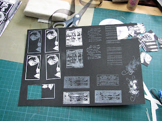
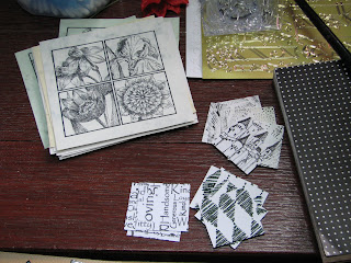
I tried a few images using different inks & embossing powders, and these are the results.
The greyish looking face section in the top left is White Staz-on & White pearl embossing powder. The music score, script and the tickets are all White Staz-on, no embossing, apart from the bottom left one which has a little embossing powder on it. The other three face sections are Moonlight White Brilliance ink, and White Detail embossing powder, which was much more successful.


However, the combo I finally went with was good old
Versamark and White Detail powder.
 I got a much more solid white print with this. These are leftover pieces from the various images I stamped, and as you can see from these and the card,  I cut them a bit randomly to give some movement to the compilation.
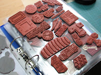
These are some of the stamps I used for
the images.I can see some Paper Artsy,
and some from Stamp Francisco.
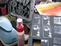
I punched out some images,and cut out others to the width of one of my Clear rulers (which happens to be 3 1/2 cm, or 1 3/8in. ),which is the same as one of my Woodware punches, so it was easier to vary the orientation.You can see the punch in the bottom left of this picture.

I chose 9 of the images which seemed to work well together, and matted them onto white card with a gap between them then matted this onto black card, both trimmed to leave the same border. I gave the base a couple of blasts with black webbing, then tied back and white organza ribbon in a knot around the left side when it was dry.
The rest of my desk looks like this:


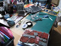
There are some black on white images cut to the same size, so I can do an opposite version, and the flower panel is a stamp called Mixed 3 Square, F1276, from Impression Obsession.

 I came across these while looking for stamped images I could cut down. I stamped them ages ago, and never got round to using them.
So out came the Promarkers, and this is the result for one square. I have separated them into individual tiles and also covered them with Anitas  3D Clear Gloss Finish, which is the same as Glossy Accents, as when I had finished the colouring, I was reminded of Victorian tiles. Thats my desk for this week, so off to the Lady Julias domain to view this weeks offerings, and a Happy WOYWW to everyone.


Sunday 17 April 2011

New Baby

This card is for a work colleague who is leaving soon to have her first baby.


 First I stamped the Baby Blocks & letters from Elusive Images in Staz-on Teal onto Acetate. I think this set is now discontinued, unfortunately. After the ink was dry, I stuck the acetate onto double sided film. Word of advice here, double check the orientation of the letter 'B' before you stick them down-you want them to read the correct way, after you add glitter to the back of the letter. And yes, I found that out the hard way. Oh well.
     Then I cut out the squares, and the letters, remembering to cut out the centres of the A & B's.


I chose a selection of blue glitters. These were bought loose at either the Hobbycrafts show at the NEC, or via E-bay. I also bought the empty bottles in the same places. Much cheaper way to get a selection of colours. I found it annoying having to keep getting the jars out of the box to find the right colour-as you can see, my solution was a squiggle of pva on the lid, then sprinkled it with glitter from the jar.


In the end, I used the pale blue for the squares and the darkest one for the letters.


I covered half of a linen card base with pale blue gingham vellum, (PDA card & paper), and added a border of punched pale blue mulberry paper. The join was covered with sticky backed 'It's a boy' ribbon.
The four squares were then mounted onto the front of the card with silicone glue.I added the letters to the squares, also with silicone glue.
The finishing touches were a folded bow from blue ribbon, a stork embellishment, and a peeloff greeting, coloured with a blue peeloff pen.

Wednesday 13 April 2011

WOYWW #97 - Baptism card

Hi everyone on WOYWW,on my desk this week is this baptism card, which has been ordered by a work colleague, who is Polish, hence the spelling of the name!
I've missed the last couple of weeks- life keeps getting in the way, blast it! lol.
The Cross image is from Creative Expressions, Kildare Cross,HH1217L.  There are a number of different crosses on their site, all wood-mounted, although my stamp is an unmounted version.They are medallion images, with means they can be stamped multiple times and then layered. I stamped the image twice in silver, onto silver paper and heat embossed them. It was also stamped once onto white vellum, and onto white silk effect card, in Brilliance Moonlight White , sprinkled with Stamp'n'stuff White Pearl embossing powder. From the two silver images, the whole image was cut out, and from the second stamped image just the centre was cut out.The vellum image was trimmed next, following the curves of the next set of lines, and also including the centre. The white stamped image was cut down to the smaller cross. Each layer was added with silicone glue, and finally an acrylic gem was added to the centre. Diamond Stickles were drawn around the base cross and the central circle.A sheet of A4  white pearl card was scored & folded, and the bottom half covered with white embossed card, and the top half with a glittered vellum.The join was concealed with a strip of ornate sticky back ribbon.
I used Nesties Labels 4 to cut one white & one silver label. The sentiment & name were added with peeloffs in silver. A length of Organza ribbon was wrapped around the spine & tied in a knot.

The rest of my desk looks like this:


The tags on the left have been inked with various Distress inks, and the stamped tags have been cut from the pastel card sheets I made a few weeks ago.


And I have been busily cutting tags of assorted sizes, from a manilla coloured card, and from white.

Sunday 10 April 2011

A4 cards

Although it isn't obvious from the picture, this card is a full A4 in size. For this I use white A3 card, from Staples. This card is not particularly thick, but I resolve this by attaching a full A4 sheet of card to the back of the folded A3, and when the card front is covered, and whatever images & embellishments are added, it becomes perfectly solid. I found this much easier than other methods, which rely on attaching 2 x A4  sheets together with a fold & DST.
This was made for a lady who I work with, who is retiring, and I use the A4 size as it allows plenty of space for people signing it inside.
 For the main image I used the Penny Black 'Aspire' stamp again, onto a brayered A5 background, cut to three panels.This was matted onto grey, then gold embossed card.Before matting onto gold, I wrapped some lilac organza ribbon around the image. A folded bow was added with glue dots. I punched the corners of the gold card with a Southwest punch.The front of the card was covered with a sheet of lilac paper, from a Papermania pad. The same lilac ribbon was wrapped around the spine, and tied in a bow. Two sizes of Nesties Labels 8 were cut from gold card, and one from purple. The sentiment and name of the recipient were added in gold Peeloff letters.

 This is a second card made for a work colleague, also A4, and the image was originally the front for a square card,but I had to do this card in a hurry, so I cannibalised ! The front was covered in a piece of 12 x 12 scrapbook paper, which had words like 'friend, memories,' etc on it. The corners were covered with Happy Birthday paper. I cut the numbers from dark brown glittered paper, bought in a pad from Hobbycrafts, then cut 'shadows' from gold glittered paper.Peeloff sentiment, name and balloons completed it.

Monday 4 April 2011

Mothers Day

I've been busy for the last couple of weeks, so this is my first post for two weeks, and I missed WOYWW last week too.Here are a couple of Mothers day cards, the first one is an adaptation of the Valentines card made a few weeks ago.

                                                   I knew this design was going to be useful!

The second card is made with an Elusive Images stamp, Daffodil Script.The image was stamped twice, the second image had the Daffodil coloured and cut out, then mounted with silicone glue over the first image.The Gold coloured Mothers Day vellum was printed on my pc, then sprinkled with Gold embossing powder and heat set.
Printing/embossing like this is do-able on your pc, it just takes some trial and error, as every printer is different
regarding how much ink it puts on the paper, and you need ink wet enough to take embossing powder, but not so wet as to go 'spidery'.I found a reasonable quality vellum, and for my printer, using the photo quality setting for glossy photo paper worked best, but its best to try out just a line of text at a time, till you get it right.

These are a few of the different sheets I have printed & embossed.

 I have also printed some labels showing how to display Easel cards, which I can stick onto the reverse of the card.

An End of an era

An end of an era

I write this with a broken heart, that only time can heal My beautiful, wonderful wifelet Shaz (Silverwolf) passed away peacefully in the ea...